
I launched my first startup in 2019 with $500 in my bank account. I needed a logo, a website, social media graphics, and pitch deck slides. Hiring a designer would cost $3,000. Money I didn’t have.
So I learned to fake it. I found free tools, copied designs I liked. I used every shortcut I could find.
Three years later, people still ask me who my designer is. I smile and say “me.” They don’t believe me.
Here’s every design hack I’ve learned as a founder who can’t draw a straight line.
TL;DR
| Hack / Tool | What It Does | Quick Tip / Shortcut |
| Canva | Social posts, logos, presentations | Save brand colors & fonts; use templates |
| Figma | Website & app mockups | Use free Figma templates; customize instead of starting from scratch |
| Remove.bg | Removes image backgrounds | Add a simple colored background in Canva for a professional look |
| Coolors | Generates color palettes | Check contrast ratio; pick 3 main colors |
| Unsplash | Free high-quality stock photos | Avoid popular images; use less obvious keywords |
| Templates | Reusable graphics for social, presentations, emails | Build 5 master templates; copy & edit only text/images |
| 3-Color & 2-Font Rule | Simplifies design consistency | Primary, secondary, neutral colors; one font for headings, one for body |
| White Space & Grid Systems | Makes designs readable & professional | Remove non-essential elements; align to grids |
| Steal Like an Artist | Inspire from top designs | Take ideas, remix with your colors/fonts |
| Design in Constraints | Speeds up design decisions | Limit colors, fonts, button sizes, and spacing |
| Screenshot Mockups | Test ideas before building | Edit screenshots in Canva or Figma for investor/user feedback |
| AI Design Assistant | Quick design advice & content ideas | Use ChatGPT for colors, social posts, landing page content |
| When to Hire a Designer | Scale or complex visuals | Hire at $10K+/month revenue, for full rebrands, animations, or illustrations. Or explore Design Shifu for unlimited startup design support without hiring full-time |
| Action over Perfection | Launch faster & iterate | Ugly designs > no designs; refine over time |
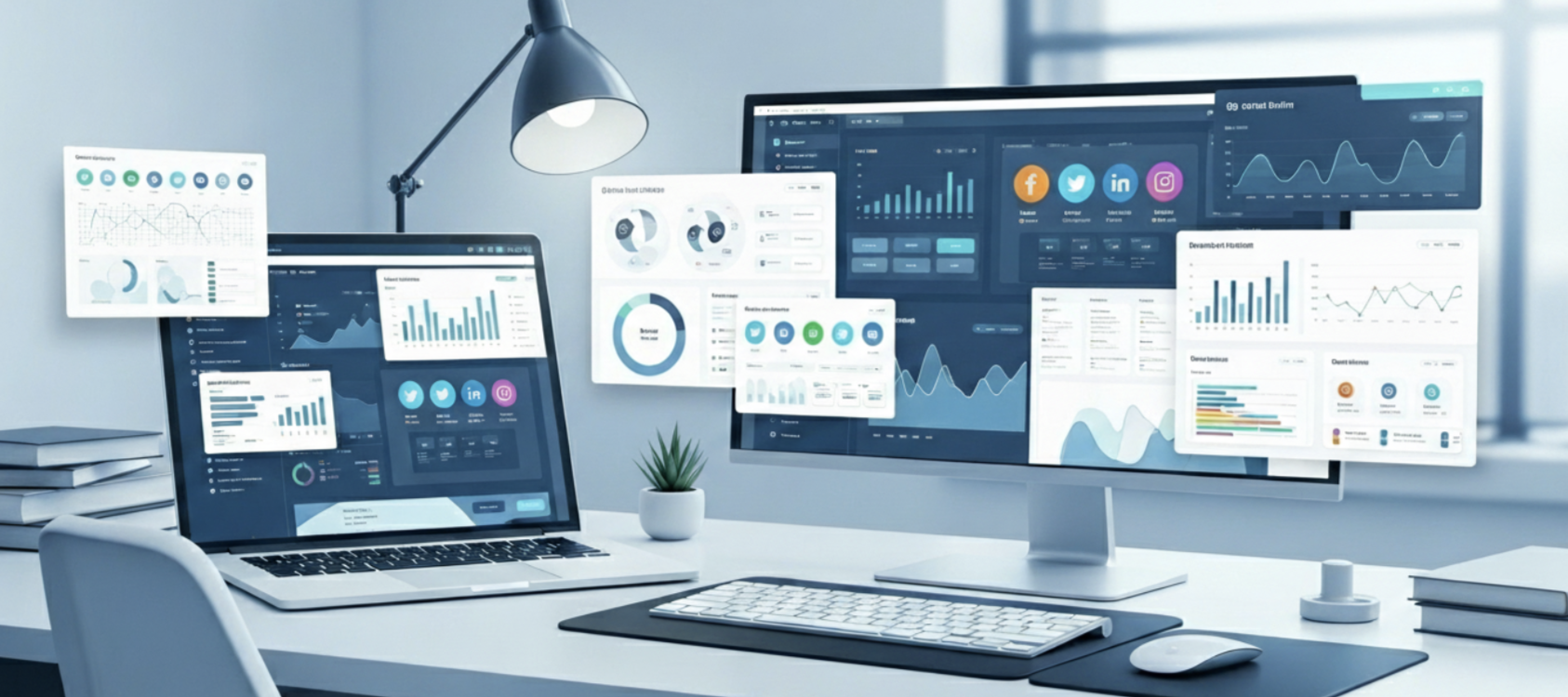
Why Founders Need Design Skills
Let me be honest. Your product might be amazing. But if it looks bad, nobody will care. To truly make your brand stand out, it’s worth understanding how your logo fits into your larger identity, here’s a clear breakdown of Brand Identity vs Logo that every founder should know.
Research shows people judge your business in 0.05 seconds, and 94% of that judgment comes from design. Not your technology. Not your idea. Just how it looks.
I learned this the hard way. My first landing page looked like it was made in 2005. Bright blue Comic Sans font. Clip art images. It was terrible. I got 500 visitors in the first week. Zero sign-ups. Not one.
I redesigned it using the hacks I’m about to share. Same product. Same price. Better design. Next week I got 83 sign-ups from 450 visitors. That’s an 18% conversion rate. The only thing that changed was design.
The 5 Free Tools Every Founder Needs
You don’t need expensive software. These free tools will handle 90% of your design needs.
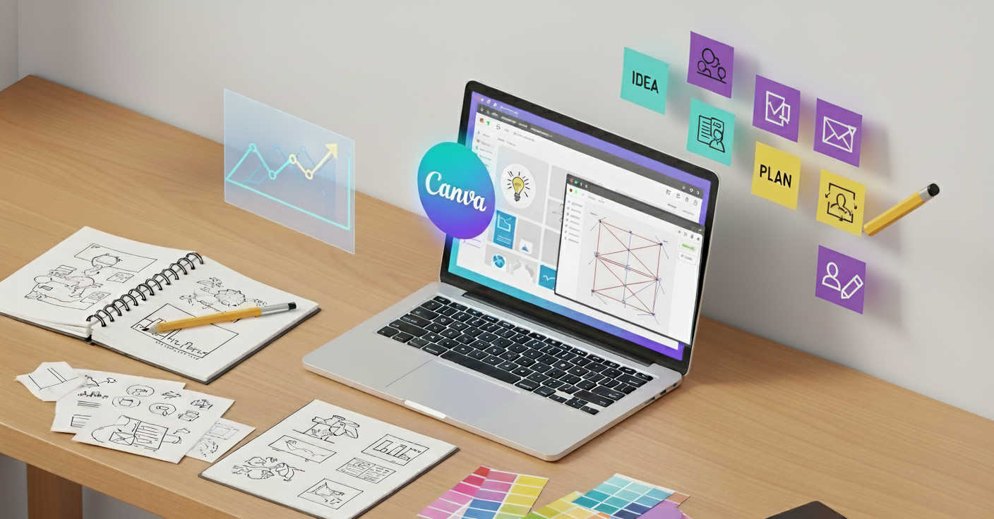
1. Canva (For Everything Visual)
Canva is like Photoshop’s friendly younger brother. It’s free and stupidly easy to use.
I use it for logos, social posts, presentations, and thumbnails. The free version has thousands of templates. You just change the text and colors.
- My hack: Save your brand colors and fonts in Canva. Then every design stays consistent. Takes 5 minutes to set up, saves hours later.
- Best for: Social media graphics, presentations, simple logos, posters, infographics.
2. Figma (For Website and App Design)
Figma is what professional designers use. But it’s free for individuals. It’s more powerful than Canva but has a steeper learning curve.
I designed my entire app interface in Figma before writing a single line of code. This saved me from building the wrong thing.
- My hack: Search “free Figma templates” on the Figma community page. Copy a template that’s close to what you need. Then customize it. Don’t start from scratch.
- Best for: Website mockups, app designs, product prototypes.
3. Remove.bg (For Removing Image Backgrounds)
This tool does one thing perfectly. It removes backgrounds from photos instantly. No manual selection needed.
I use it to make product photos look professional. Take a photo with your phone. Upload to Remove.bg. Get a clean image with a transparent background.
- My hack: After removing the background, add a simple colored background in Canva. Instant professional product photo.
- Best for: Product photos, team headshots, any image that needs a clean background.
4. Coolors (For Picking Color Palettes)
Choosing colors is hard. Coolors make it easy. Press the spacebar and it generates random color combinations. Keep pressing until you find something you like.
I spent 15 minutes on Coolors and found my brand colors. Those same colors are still my brand three years later.
- My hack: Generate a palette you like. Then check the contrast ratio. Your text color and background color need good contrast. Coolors shows you this automatically.
- Best for: Brand colors, website colors, any color decisions.
5. Unsplash (For Free Stock Photos)
Unsplash has millions of high-quality photos. All completely free. No attribution required.
I used Unsplash photos for my entire first website. Nobody could tell they were stock photos.
- My hack: Don’t use the most popular images. Search for less obvious keywords. Everyone uses the same 100 popular images. Go deeper.
- Best for: Website backgrounds, blog images, social media posts.
Once you get comfortable with these tools, you can even build your own repeatable design process. Check out this guide on Affordable Design Systems for One-Person Brands to stay consistent without extra effort
The Template Strategy That Saved Me 20 Hours a Week
In my first year, I spent 3 hours every day creating graphics. Social posts, presentations, emails. It was exhausting. Then I discovered templates. Now I spend 30 minutes per week on the same tasks.
Here’s my system:
- Step 1: Create 5 master templates. One for social posts. One for presentations. One for emails. One for blog images. One for ads.
- Step 2: Use the same colors, fonts, and layout in all templates. This creates brand consistency.
- Step 3: When you need something, copy a template. Change only the text and photos. Never start from scratch.
I made my templates in one weekend. They’ve saved me hundreds of hours since then. If you’re serious about saving time, start building a personal template bank. This post on How to Prioritize Design Projects Effectively shows exactly how to organize your assets for faster, smarter design work.
The 3-Color Rule
Most founders use too many colors. Their brand looks like a rainbow exploded. Professional brands use 3 colors maximum. A primary color, a secondary color, and a neutral color.
Look at any major tech company. Apple uses white, black, and one accent color. Stripe uses purple, white, and dark blue. Spotify uses green, black, and white.
My system:
- Primary color: Use this the most (buttons, headers, logos)
- Secondary color: Use this for accents and highlights
- Neutral color: Usually white, black, or gray for backgrounds and text
I chose orange as my primary, navy as my secondary, and white as my neutral. Every design uses only these three colors. People now associate orange with my brand.
The Typography Shortcut
Fonts matter more than you think. Bad fonts make you look unprofessional. Good fonts make you look expensive.
But choosing fonts is hard. Here’s my shortcut:
Use only Google Fonts. They’re free, professional, and work everywhere. Don’t use weird decorative fonts you found on random websites.
My favorite combinations:
- Modern and clean: Inter for everything
- Professional and serious: Roboto for body text, Roboto Slab for headlines
- Friendly and approachable: Open Sans for body text, Poppins for headlines
- Creative and unique: Playfair Display for headlines, Source Sans Pro for body text
Pick one combination. Use it everywhere. Your website, presentations, social media. Everything.
The golden rule: Never use more than 2 fonts. One for headlines, one for body text. That’s it.
White Space Is Your Secret Weapon
Beginners cram everything together. Professional designs have lots of empty space. White space (empty space) makes designs easier to read. It makes brands look premium. Compare two websites in your mind. One is packed with text, images, and buttons everywhere. The other has lots of breathing room. Which one looks more expensive?
The second one. Always.
My hack: After finishing a design, remove 30% of the elements. Delete the stuff that isn’t essential. Your design will instantly look better.
I redesigned my landing page by removing half the content. Conversion rate went up by 40%. Less is more.
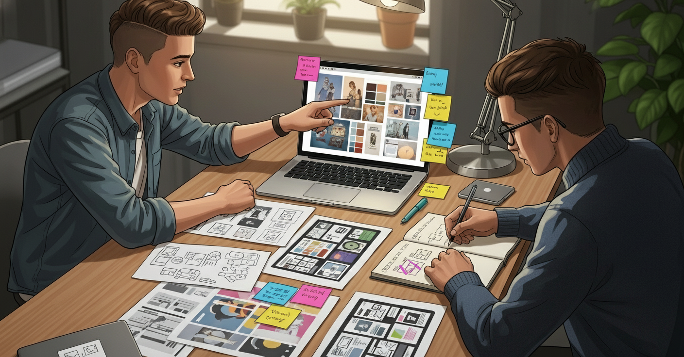
The Steal Like an Artist Method
Here’s a secret. Professional designers copy other designers constantly. They call it “getting inspiration.” I call it smart.
When I need to design something, I find 3 examples I like. I look at what they have in common. Then I create something similar but not identical.
Where to find inspiration:
- Dribbble: Designers post their work here
- Behance: More designer portfolios
- Land-book: Beautiful website designs
- Really Good Emails: Email design inspiration
- Mobbin: Mobile app designs
Important: Don’t copy exactly. Take ideas and make them your own. Change colors. Use different fonts. Adjust the layout.
I designed my app by looking at 20 similar apps. I took the best ideas from each. My app looks original but is actually a remix of proven designs.
Design in Constraints
Want to design faster? Add constraints. Give yourself rules that limit choices.
My design constraints:
- Only use 3 colors
- Only use 2 fonts
- All images must have rounded corners
- All buttons must be the same size
- All spacing must be multiples of 8 pixels
These rules sound limiting. But they actually make designing faster. I don’t waste time deciding if this button should be 47 pixels or 52 pixels. Everything is 48 pixels (a multiple of 8).
Professional design systems like Material Design and Apple’s Human Interface Guidelines are just fancy constraint systems.
The Screenshot Strategy for Quick Mockups
Need to show investors what your product will look like? Don’t build it first. Fake it.
I create fake screenshots to test ideas before coding anything. Here’s how:
- Step 1: Find a screenshot of a similar app or website.
- Step 2: Open it in Figma or Canva.
- Step 3: Cover the existing content with white rectangles.
- Step 4: Add your own text and images on top.
I made 15 “screenshots” of my app before writing any code. Investors loved seeing the vision. Users gave feedback that changed the entire design. Imagine if I’d built it all first.
The AI Design Assistant You Didn’t Know You Had
ChatGPT isn’t just for writing. I use it for design decisions constantly.
Questions I ask ChatGPT:
- “What colors work well with navy blue for a tech startup?”
- “Give me 10 ideas for social media posts about project management”
- “What should I include on my landing page for a scheduling app?”
- “Critique this design” (then I describe my design)
ChatGPT gives solid advice in seconds. It’s like having a design consultant on call 24/7.
I also use AI image generators like Midjourney for unique images. But honestly, I still prefer Unsplash for most things. AI images often look a bit off.
The 60-30-10 Color Rule
This rule comes from interior design but works perfectly for digital design. Use your primary color for 60% of the design. Your secondary color for 30%. Your accent color is 10%. This creates balance. Too many accent colors make designs feel chaotic. This rule keeps things organized.
I use white for 60%, navy for 30%, and orange for 10%. My designs feel cohesive because the proportions are consistent.
The Screenshot-Edit-Upload Workflow
Need custom icons or graphics but can’t draw? Neither can I. Here’s what I do:
- Step 1: Find a similar icon on The Noun Project (free icons).
- Step 2: Screenshot it or download it.
- Step 3: Upload to Canva.
- Step 4: Change the color to match your brand.
- Step 5: Add it to your design.
This takes 2 minutes. Creating custom icons from scratch takes 2 hours. The result looks almost identical.
Grid Systems Make Everything Look Professional
Professional designs use invisible grids. Everything lines up perfectly. Amateur designs have elements placed randomly. Nothing lines up. It looks messy even though you can’t explain why.
The quick fix: Turn on the grid in Canva or Figma. Snap everything to the grid. Instantly looks more professional. Most designers use a 12-column grid for websites. 4-column grid for mobile designs. You don’t need to understand why. Just use them.
The Rule of Thirds for Better Photos
If you’re taking photos for your startup, use the rule of thirds. Imagine your camera view divided into 9 squares (3×3 grid). Put important stuff at the intersection points. Not in the center.
I take all my product photos this way. They look way more professional than centered photos. Most phone cameras have a grid option. Turn it on. Use it.
Design Feedback Without a Design Team
You finished a design. But you don’t know if it’s good. You need feedback.
Places to get free feedback:
- Post on Twitter with #DesignFeedback
- Share in startup communities on Reddit (r/startups, r/entrepreneur)
- Ask in Indie Hackers forum
- Post in Facebook groups for founders
What to ask: “What’s confusing about this design?” Not “Do you like it?” People will give better feedback when you ask specific questions. I post every major design decision on Twitter. I usually get 10-20 helpful comments. This has saved me from launching several terrible designs.
When to Actually Hire a Designer
I’ve done everything myself for three years. But I’m finally hiring a designer for one specific thing: my logo.
Hire a designer when:
- You’re ready to seriously scale (making $10K+ per month)
- You need something complex (detailed illustrations, animations)
- Your DIY designs aren’t converting well
- You’re redesigning your entire brand
At that stage, an unlimited design service can be a total game-changer. Get high-quality visuals for your startup without hiring full-time, see how Design Shifu works.
Don’t hire a designer when:
- You’re just starting out
- You need quick social media posts
- You’re still figuring out your brand
- You can’t afford it yet
Save your money. Learn these hacks first. Hire help later when the ROI is clear.
The Honest Truth About Design
Your first designs will be ugly. Mine were terrible. That’s normal. But here’s what nobody tells you: your ugly designs are better than no designs. Launch with what you have. Improve it later.
I’ve redesigned my website four times. My logo twice. My app interfaces three times. Each version was better than the last. Perfect design doesn’t exist. Good enough design that ships beats perfect design that stays in Figma forever.
Key Takeaways
- Design matters: First impressions are made in 0.05 seconds, 94% based on design.
- Free tools can replace expensive software: Most design needs can be handled without hiring a professional.
- Consistency is everything: Color palettes, fonts, and templates make your brand look professional.
- Less is more: White space, grids, and the 3-color rule improve perceived quality.
- Hustle smart: Copy, remix, and iterate instead of starting from scratch every time.
- Action beats perfection: Launch with good-enough designs; refine later.
Your Action Plan
Stop reading. Start doing. Here’s what to do right now:
- Open Canva and create an account
- Choose 3 brand colors using Coolors
- Pick 2 fonts from Google Fonts
- Create one social media template
- Use it tomorrow
That’s it. Don’t overcomplicate it.
You’re a founder. Not a designer. These hacks give you just enough design skill to look legitimate while you build your actual business. Save the fancy design stuff for when you’re successful. For now, these shortcuts are more than enough.
FAQs
What are the best design tools for startup founders?
The best free design tools for founders are Canva, Figma, Remove.bg, Coolors, and Unsplash. These tools handle everything from logo design to web mockups and branding assets.
How can non-designers create professional visuals?
What’s the 3-color rule in design?
When should founders hire a professional designer?
What is the best unlimited design service for startups?