
Thumbnails are the billboards of YouTube. You could have the best E-commerce video in the world, but if your thumbnail flops, nobody’s clicking. It’s not just a design detail, it’s the difference between 12 views and 12,000.
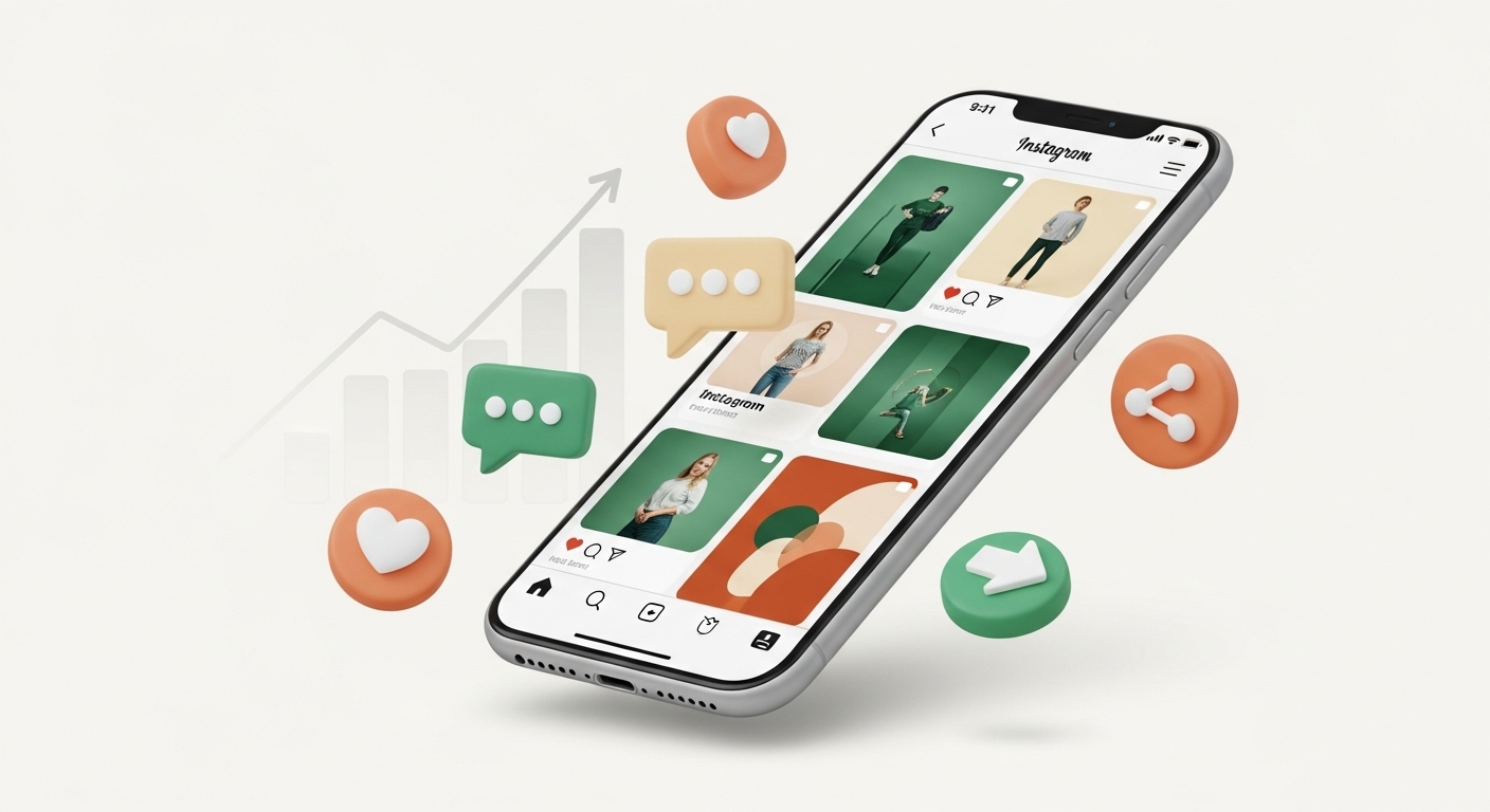
Here’s the thing nobody tells you when you’re managing an ecommerce brand’s YouTube channel: YouTube thumbnails for ecommerce are the first impression that decides if customers click or scroll past. It’s your storefront window. Your book cover. Your first impression, last chance, and everything in between.
And honestly? Most ecommerce managers are getting it completely wrong.
In this guide, we’ll break down the thumbnail strategies that actually get clicks, sales, and subscribers without needing to be a designer.
TL;DR
- Most ecommerce managers struggle with YouTube thumbnails because they treat them like product photos instead of promises. Thumbnails are the most overlooked but powerful video marketing tips for ecommerce managers.
- Thumbnails should highlight transformation, emotion, and value while standing out visually.
- Use bold text, faces, before/after comparisons, and emotional triggers.
- Test designs, keep mobile in mind, and don’t settle for auto-generated screenshots.
- A better thumbnail alone can double or triple your video views.
Why Your Current Thumbnails Probably Aren’t Working
Let me guess. You’re using product photos from your website, maybe slapping your logo on there, and calling it a day. Or worse – you’re letting YouTube auto-generate those blurry, random screenshots that make your brand look like it was designed by a distracted intern.
I get it. You’re juggling inventory, customer service, ad campaigns, and now someone expects you to be a graphic designer too?
But here’s what I learned after watching my own ecommerce videos struggle: people don’t click on products. They click on promises.
The Psychology Behind Clicks
Your potential customers are scrolling through YouTube with the attention span of a caffeinated squirrel. They’ve got their phone in one hand, probably doing three other things, and you have literally 0.3 seconds to make them stop.
Think about it like this: when you’re walking through a busy shopping district, what makes you pause? It’s not the store with the perfectly organized display. It’s the one with the crowd gathered outside, the interesting window that tells a story, or the bold sign that promises to solve a problem you didn’t even know you had.
Your thumbnail needs to be that interesting window.
The 5-Second Test That’ll Save Your Sanity
Before we dive into the nitty-gritty, try this:
Show your thumbnail to someone for exactly five seconds. Then ask them:
- What’s this video about?
- Who is it for?
- Why should they care?
If they can’t answer at least two of these questions, back to the drawing board. Don’t take it personally (I’ve failed this test more times than I care to admit).
The STOP Formula: Your New Best Friend
After analyzing hundreds of successful YouTube thumbnails for ecommerce,and making plenty of my own mistakes, I’ve found that winning thumbnails follow this pattern
- S – Show the transformation
- T – Trigger emotion
- O – Offer clear value
- P – Pop visually
Let me break this down…
Show the Transformation
Your customers aren’t buying products. They’re buying better versions of themselves.
Instead of showing your skincare product sitting pretty on a white background, show the before and after. Don’t just display your organizational tool – show the messy closet versus the Instagram-worthy space.
Quick example: Instead of “Our New Protein Powder,” try “From Dad Bod to Fit Dad in 90 Days” with a split-screen transformation image.
Trigger Emotion
Fear, excitement, curiosity, frustration – emotions make people click. And as an ecommerce manager, you know your customers’ pain points better than anyone.
Are they overwhelmed by clutter? Frustrated with slow results? Embarrassed about their current situation? Your thumbnail should acknowledge that feeling and promise relief.
Offer Clear Value
What will they know, feel, or be able to do after watching your video that they can’t do right now? Make it obvious.
“5 Kitchen Hacks” is boring. “5 Kitchen Hacks That Cut Meal Prep Time in Half” is clickable.
Pop Visually
This is where most ecommerce managers get stuck. You don’t need to master graphic design, but you do need to understand the basics of YouTube thumbnail design
Quick visual tips:
- Use bold, contrasting colors
- Make text large enough to read on mobile
- Avoid cluttered backgrounds
- Include faces when possible (they naturally draw attention)
- Create visual hierarchy – one main focal point
The Mistakes That Are Killing Your Views
- Mistake #1: Product-First Thinking Stop thinking like a catalog. Start thinking like a problem-solver.
- Mistake #2: Boring Backgrounds That seamless white background might work for your product listings, but it’s invisible on YouTube. You need contrast and visual interest.
- Mistake #3: Tiny Text If someone can’t read your text on their phone, they won’t click. Period.
- Mistake #4: No Human Element People buy from people. Even if you’re selling gadgets, include human faces, expressions, or hands using your product.
- Mistake #5: Being Too Polished This sounds counterintuitive, but overly perfect thumbnails can feel sterile. A little authentic messiness builds trust.
Tools That Won’t Break Your Budget
You don’t need Photoshop or a design degree. Here are the tools I actually use:
- Canva – It’s like training wheels for design. Templates, drag-and-drop, done. Their YouTube thumbnail design templates are specifically sized correctly.
- Snapseed – Free mobile app that’s surprisingly powerful for quick edits and text overlays.
- Remove.bg – Instantly removes backgrounds from product photos so you can place them on more interesting backgrounds.
- Unsplash – Free, high-quality background images that don’t look like stock photos.
A/B Testing: Your Secret Weapon
Here’s something most people won’t tell you: YouTube actually lets you test different thumbnails on the same video. Testing different YouTube thumbnails for ecommerce is the fastest way to boost CTR.
Upload your video with one thumbnail, then after a few hours, change it. Compare the click-through rates. It’s not perfect science, but it’ll give you insights into what resonates with your actual audience.
Pro tip: One of the most underrated YouTube CTR tips is swapping thumbnails and tracking click-through rates. Test radically different approaches, not just color variations.
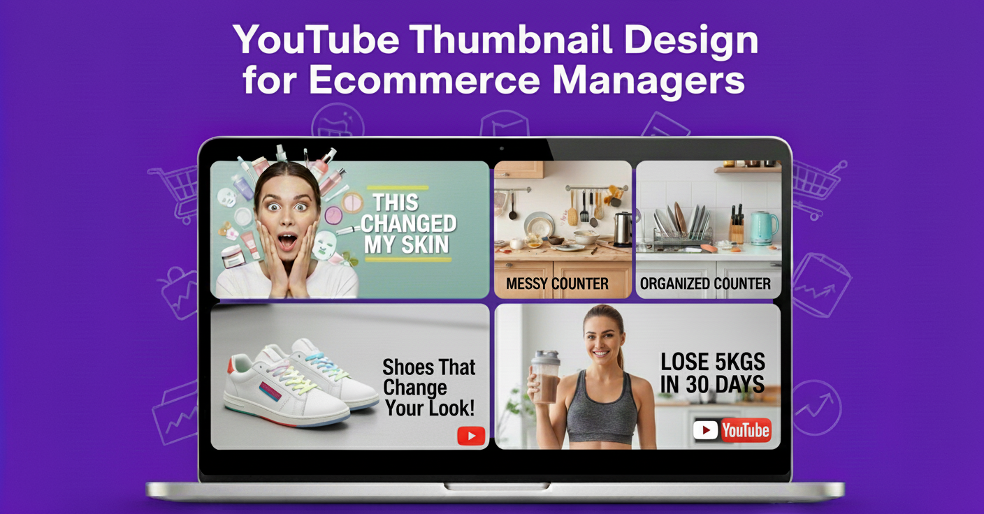
The Templates That Actually Work
After running hundreds of tests, here are the thumbnail formulas that consistently perform for ecommerce brands:
- The Before/After Split Perfect for any product that creates visible change. Skincare, organization, home improvement, fitness.
- The Shocked Face + Big Promise Works especially well for “surprising” products or little-known tips. The expression sells the emotion.
- The Problem/Solution Contrast Show the frustrating problem on one side, your product solving it on the other.
- The “Results” Screenshot Social proof in thumbnail form. Show customer reviews, testimonials, or transformation photos.
Real Examples (The Good, Bad, and Ugly)
Let me share some real examples I’ve seen…
- What doesn’t work: A pristine product shot with a small logo and generic “New Product Launch” text. Looks like an ad, feels like an interruption.
- What works: Same product, but shown in someone’s hands, with surprised expression, bold text reading “This $15 Gadget Replaced My $200 Tool” with clear before/after comparison in the background.
See the difference? Same product, completely different promise and emotional hook.
The Mobile Reality Check
Here’s your homework: Look at your current thumbnails on your phone. In YouTube’s mobile app. In low light. While you’re distracted.
Can you still tell what the video’s about? Is the text readable? Does it stand out among other videos?
If not, you know what to fix first.
Quick Wins You Can Implement Today
- Add faces to your thumbnails – Even if it’s just hands using your product or a customer’s genuine reaction
- Make your text bigger – If it’s not readable at thumbnail size, it’s not working
- Use the rule of thirds – Don’t center everything. It’s boring.
- Test emotional triggers – Replace product names with benefit-focused text
- Check your contrast – Dark text on dark backgrounds is invisible
- If you’re short on time, YouTube CTR tips will help you make immediate improvements
The 24-Hour Challenge
Pick your worst-performing video from the last month. Create a new thumbnail using everything we’ve talked about. Upload it and see what happens to your views in the next 24 hours.
Don’t change anything else about the video – just the thumbnail. You might be surprised by the results.
Pro Tip
If you’re serious about ecommerce video marketing, start with thumbnails. Strong YouTube thumbnail design improves CTR, drives ecommerce brand growth on YouTube, and helps your videos stand out in competitive feeds. In fact, many of the best video marketing tips for ecommerce boil down to one thing: getting people to click in the first place.
Final Thoughts
At the end of the day, your YouTube thumbnail is your digital storefront window. It decides whether someone walks past your brand or walks in. By shifting from product shots to emotional, transformation-driven visuals, you’ll instantly stand out from your competitors.
Most ecommerce managers still overlook YouTube thumbnails for ecommerce, and that’s exactly where you can win. Give them attention, test relentlessly, and watch your videos and sales take off.
Key Takeaways
- Thumbnails are promises, not product photos.
- Use the STOP Formula: Show transformation, Trigger emotion, Offer value, Pop visually.
- Faces + emotions > sterile product shots.
- Keep thumbnails bold, simple, and readable on mobile.
- Use A/B testing to find what clicks.
- Small design tweaks (contrast, text size, emotion) can mean massive view growth.
FAQs
How important are thumbnails for YouTube ecommerce videos?
Extremely. They directly impact your click-through rate (CTR), which determines how many people even watch your video in the first place.
Can I use product photos for thumbnails?
Do I need a designer to make good thumbnails?
How much text should I put on a thumbnail?
What’s the best thumbnail style for ecommerce brands?
How do I know if my thumbnails are working?