
What makes people stop scrolling and actually notice your startup? In a world where attention spans are shrinking and competition is fierce, you need more than luck, you need ad creatives that convert.
In today’s endless scroll of content, grabbing attention is tougher than ever. Your startup might be amazing, but without the right first impression, people just keep scrolling.
That’s where ad banners come in. Think of them as your business’s digital handshake, simple, bold, and your chance to say, “This is worth a look.” Let’s build one that captures attention without trying too hard.
TL;DR
- Banners still work in 2025 if done right.
- Keep messaging simple with one clear idea.
- Design cleanly: 2–3 colors, 2 fonts, relevant imagery.
- Use strong CTAs like “Get Started” or “Shop Now.”
- Test, tweak, and repeat, data beats guesses.
- Outsource if needed to save time and stress.
Start with Why It Matters
You’re not just slapping a banner on a website because it’s trendy. You’re fighting for attention in a world where everyone’s distracted. A good ad banner is like a handshake, it’s your first chance to say, “Hey, I’m worth your time.”
It’s got to look sharp, feel real, and make someone curious enough to click. Whether it’s for your SaaS tool, e-commerce store, or that app you’ve been coding in your garage, this banner is your mini-billboard.
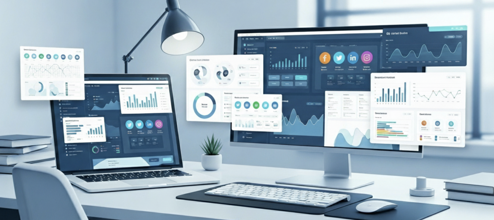
According to DataReportal’s Digital 2025 report using Statista’s Market Insights, global ad spending hit US$1.1 trillion in 2024, with digital channels making up nearly 73%. DataReportal – Global Digital Insights This shift shows how important online banners are becoming, and why startups can’t afford to ignore ad banner design anymore
Step 1: Nail Your Message
Before you touch any design tools, figure out what you’re trying to say. One sentence. That’s it. What’s the one thing you want someone to know about your startup?
Maybe it’s “We make invoicing so easy you’ll actually enjoy it.” Or “Your dream website, built in minutes.” Keep it stupid simple. People don’t read, they scan. If your message takes more than three seconds to get, you’ve already lost them.
Pro tip: Write down five versions of your message. Pick the one that feels like you’re talking to a friend. For example, when I helped a friend launch her bakery’s ad campaign, we went with “Donuts are so good, you’ll forget your diet.” It wasn’t fancy, but it was her.
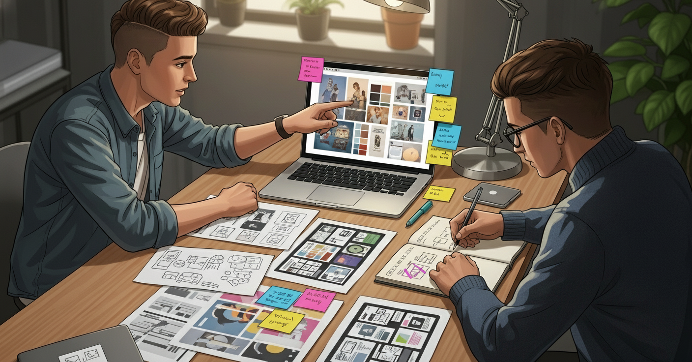
Step 2: Keep the Design Clean
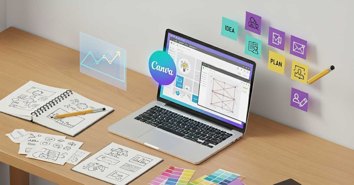
You don’t need to be a Photoshop wizard to make this work. Tools like Canva or Figma have templates that do the heavy lifting. Pick a clean layout, less is more. Think of your banner like a storefront window. Too much clutter, and nobody’s walking in.
- Colors: Stick to two or three colors that match your brand. If your logo’s blue and orange, don’t suddenly throw in neon green. (I did that once. Disaster.)
- Fonts: Use one bold font for your main message and a simpler one for any secondary text. No Comic Sans. Ever.
- Images: If you use an image, make it relevant. Selling coffee? Show a steaming mug, not a random sunset. No stock photos of overly happy people in suits, please they scream “I’m not authentic.”
And remember: your banner design must connect to where it’s sending traffic. A clean design paired with a landing page design that drives conversions makes the entire journey seamless.
Step 3: Make It Pop (Without Being Annoying)
You want your banner to stand out, but not like a used car salesman waving his arms. A subtle animation (like a slight fade-in) can catch the eye without being obnoxious.
If you’re not sure where to start, Canva has free animation options that are dead simple to use. Just don’t overdo it, nobody likes a banner that’s flashing like a Vegas slot machine.
Step 4: Size It Right
Banners come in standard sizes, like 300×250 (square) or 728×90 (leaderboard). Check where your ad’s going to live Google Ads, a blog, or social media and pick the size that fits. Most platforms will tell you what they need. If you’re designing for multiple places, make a few versions. It’s a pain, but it’s worth it.
Step 5: Add a Call to Action
This is where you tell people what to do. “Sign up free.” “Shop now.” “Get started.” Make it short, punchy, and impossible to ignore. Use a button if you can, it draws the eye. I once tweaked a friend’s banner from “Learn more” to “Try it free,” and clicks went up 20%. True story.
Step 6: Test It Like Your Startup Depends on It
Because, well, it kinda does. Show your banner to a few people, friends, your team, maybe even that barista who knows your order by heart.
Does this make you want to click?” If they hesitate, go back to the drawing board. You can also run a cheap test on Google Ads or Meta to see what works. Track clicks like a hawk.
And if you don’t want to juggle freelancers, consider unlimited graphic design services for startups. You’ll get quick turnarounds without the hidden costs
Key Takeaways
- Clarity wins: One clear message per banner.
- Keep it simple: Clean layouts, 2–3 brand colors, 1–2 fonts.
- Make it pop: Subtle animations > flashy distractions.
- Size matters: Match banner size to platform requirements.
- CTA is king: Short, action-oriented, and button-based.
- Test everything: Small tweaks in wording or design can boost clicks dramatically.
Final Thought
Your ad banner design isn’t just decoration, it’s a mini billboard for your startup. Keep it clean, authentic, and clickable. Done right, it’s not just another graphic, it’s a growth engine.
And if you’re too busy juggling founder life? Outsource it. Services like Design Shifu handle ad banner design with unlimited requests, quick turnarounds, and no hidden fees, so you can focus on scaling.
FAQs
What is the most effective ad banner size for startups?
It depends on the platform. For Google Display, 300×250 and 728×90 are most effective. On social platforms, stick to their recommended ad specs.
How much text should an ad banner have?
What colors work best in ad banner design?
Should startups use animation in banners?
How do I know if my ad banner design is working?
Should I DIY ad banner design or hire a pro?