

Micro-interactions can improve user engagement by up to 50% and satisfaction by 22%, according to Hackernoon summary of Nielsen Norman Group research.
These tiny design moments like a loading animation that makes you smile or a perfectly timed button hover are the invisible magic that makes digital experiences feel effortless and human.
In today’s crowded digital space, where every app and website competes for attention, micro-interactions, animations, and visual cues can turn casual visitors into loyal fans.
In this guide, we’ll explore what micro-UX is, why it matters, and how you can use it to transform “just okay” experiences into unforgettable ones.
TL:DR
- Micro UX elements are small, intentional design details that guide users and enhance interaction.
- Some slides had rich micro-interactions (e.g., hover effects, progress indicators), others had fewer.
- These elements are easy to overlook but improve usability and brand perception.
- Examples include showing load progress at specific percentages.
- Effective micro-interactions are intentional, simple, and consistent without distracting from content.
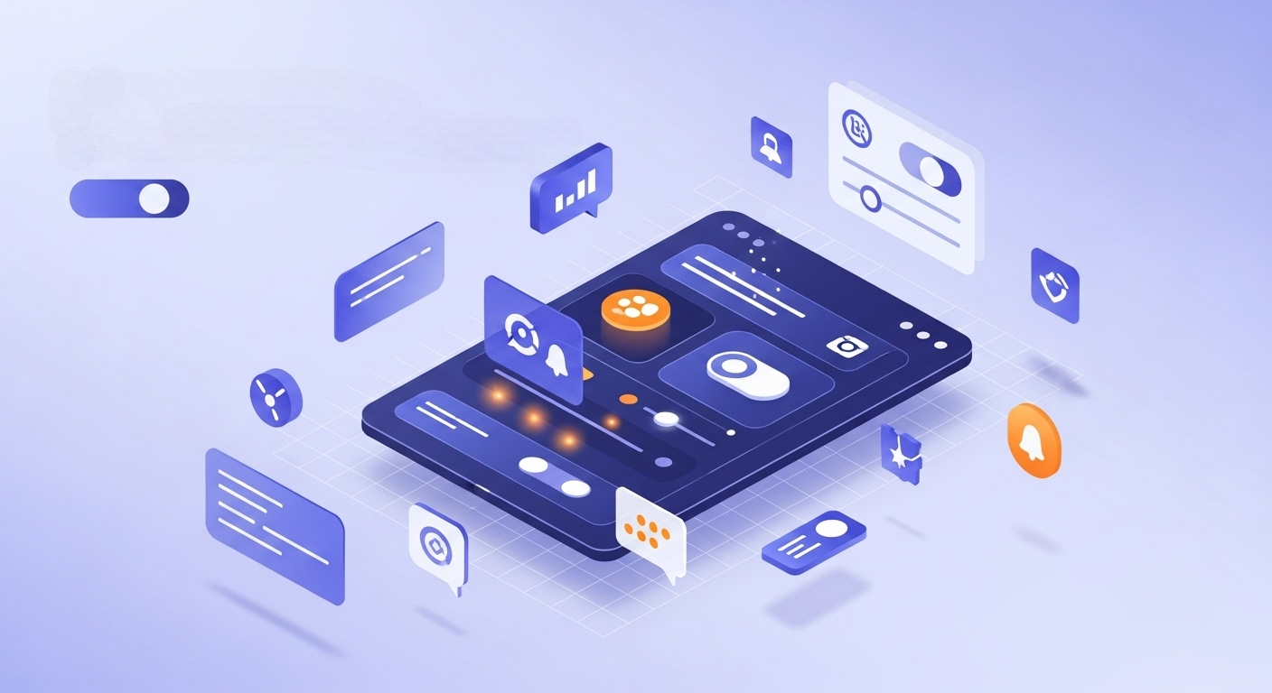
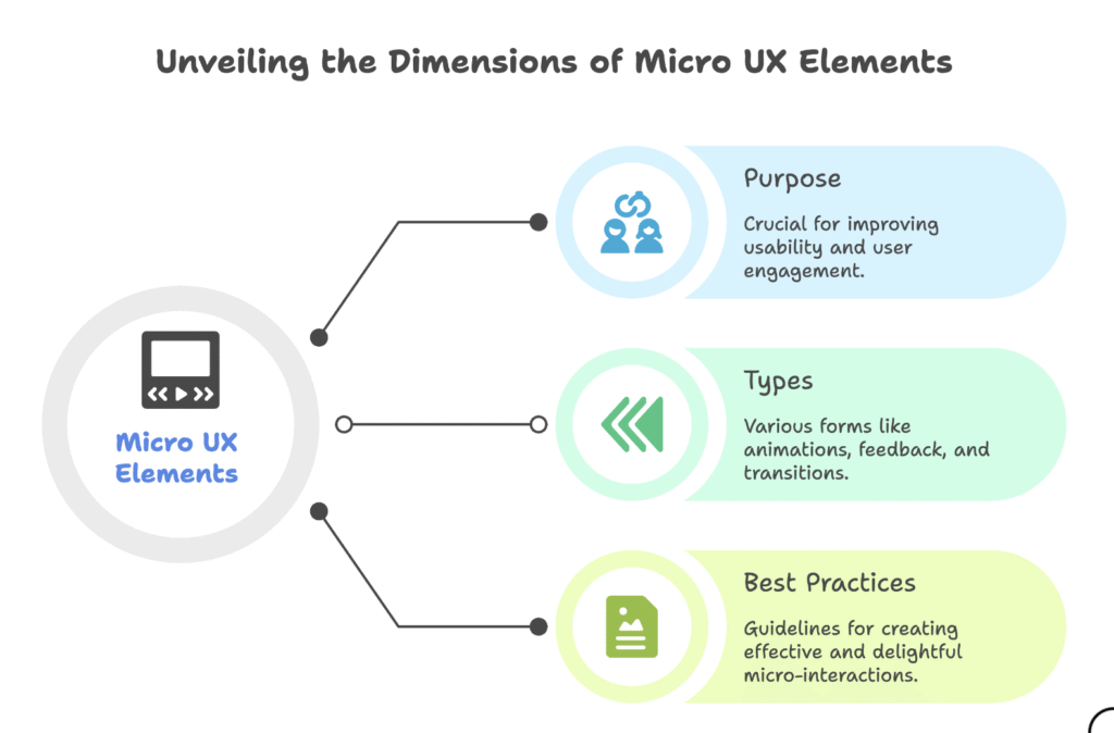
What are Micro UX Elements?
Micro UX elements often referred to as micro-interactions are small, focused design details that elevate the user experience. They work by offering subtle feedback, guiding users through tasks, or adding moments of delight during their interaction with a digital product.
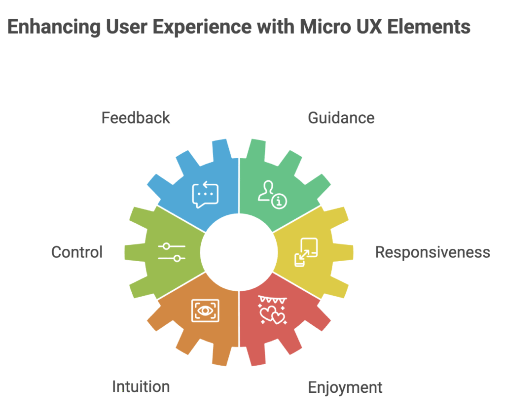
Why are Micro UX Elements Important?
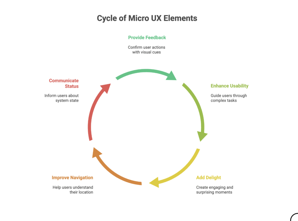
Micro-interactions have a distinct purpose
- Identifying Feedback: validating an action on the part of the user, identifying progress, failure or success
- Improved Usability: Directing a user to get through a task by adding clarification for more complex task
- Creating Delight: moments of surprise and joy to make for a more user-friendly interface
- Making Navigation easier: letting a user know where they are in the interface and what they are allowed to do next
- Indicating Status: letting a user know what the state of the system is, e.g., loading process, or if it is working
Types of Micro UX Elements
Micro-interactions come in a variety of forms including
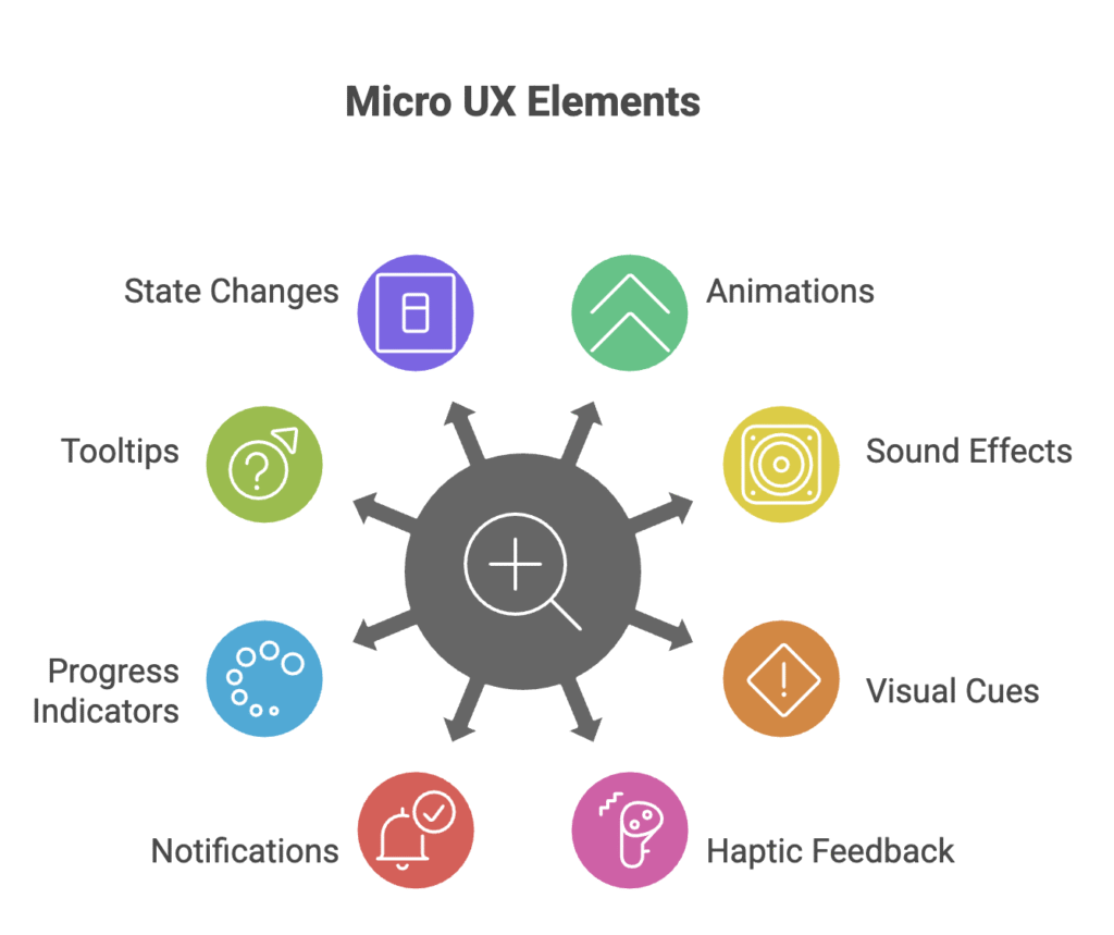
- Animations: These typically represent subtle movements that offer visual feedback or draw attention. Examples are loading animations, button hover impacts, and any animations between screens.
- Sound Effects: Sounds typically used to provide auditory confirmation of actions and/or alerts. Examples include the click of a button, the swoosh of a notification, or the chime of a completed transaction.
- Visual Cues: Visual changes to provide state or information. Examples include color changes, icon changes, and progress on certain tasks.
- Haptic Feedback: Devices may provide a vibratory sensation to give tactile confirmation of actions. Examples include the buzz of a button press on a smartphone (touchscreen), or the rumble of a video game controller.
- Notifications: Notifications are alerts sent to notify a system user of an important event or reminder. Examples include push notifications (mobile), in-app messages/messages (desktop), and email alerts.
- Progress Indicators: Representations of the user progress of a task being attempted. Examples include loading animations, progress bars, spinners, and percent indicators.
- Tooltips: Small pop-up windows providing information on next steps to complete a task, or small explanations of certain icons or labels for form fields.
- State Changes: Visual changes to indicate state. For example toggling a switch, selecting a radio button, and highlighting a list item selected.
Designing Effective Micro UX Elements: Best Practices
Designing effective micro-interactions requires careful consideration of several factors
- Purpose: It is important to articulate the purpose of the micro-interaction. What kind of feedback or guidance should it articulate? What point of pain should it help alleviate?
- Context: Consider what context the micro-interaction will occur in; how does it fit into the overall user flow? What are user expectations?
- Simplicity: Keeping the micro-interaction simple and task-oriented is crucial. Do not create complexity or add nuance that distracts from the point of interaction.
- Clarity: When designing the micro-interaction it is of utmost importance that it is clear to the user and easy to understand for the user. These are where visual cues, animations, and sound effects are intended to communicate to the user.
- Consistency: Micro-interactions should have a consistent design pattern regardless of where they occur in the interface. Similar actions should have the same visual language, animations, and sound effects throughout the entire UI.
- Timing: The timing of the micro-interaction is also important. Micro-interactions should give response time in a timely manner; do not keep the user waiting and frustrated.
- Accessibility: The micro-interaction needs to be accessible to all users, including users with disabilities. Alternative feedback may need to be utilized, such as a text description that is read by a screen reader or by producing haptic feedback.
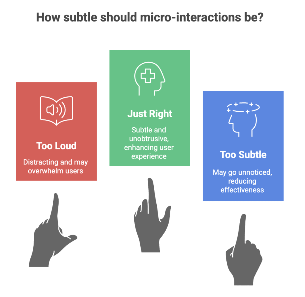
- Subtlety: Micro-interactions should be subtle and not intrusive; don’t be too loud to have animation or sound effects that will distract the user.
- Convey personality: Inject personality into the micro-interaction to help people engage with and remember your brand. Use animations, sound effects, and visual cues that reflect the identity of your brand.
- Test: Test the micro-interaction with actual users to ensure what you want done is done and that people enjoy the interaction. Collect feedback and updates based on users’ input.
Examples of Effective Micro UX Elements
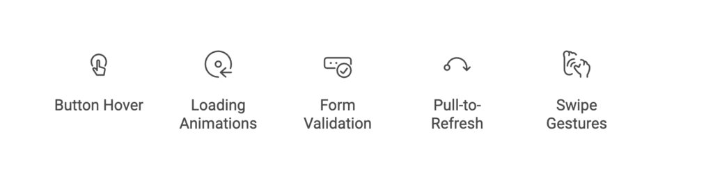
- Button Hover Effects: A simple transition that enlivens a button with animation to visually indicate it has been activated when the user hovers their mouse over it, providing clear visual feedback that can lead to clickable interaction.
- Loading Animations: A display that entertains while providing engagement to a machine process, which in turn engages the user around what is going on, i.e. loading data.
- Form Validation: A live-verification mechanism that lets the user know if their input into a form is valid, preventing errors and increasing usability.
- Pull-to-Refresh: A gesture which performs a refresh action, the pull-to-refresh is a natural and simple interaction pattern that enables the user to re-get information efficiently and easily.
- Swipe Gestures: Any type of action to navigate between screens in horizontal direction by sliding (swiping) left and right. Swipe gestures simplify the process, create an efficient interface and can make the user experience more intuitive.
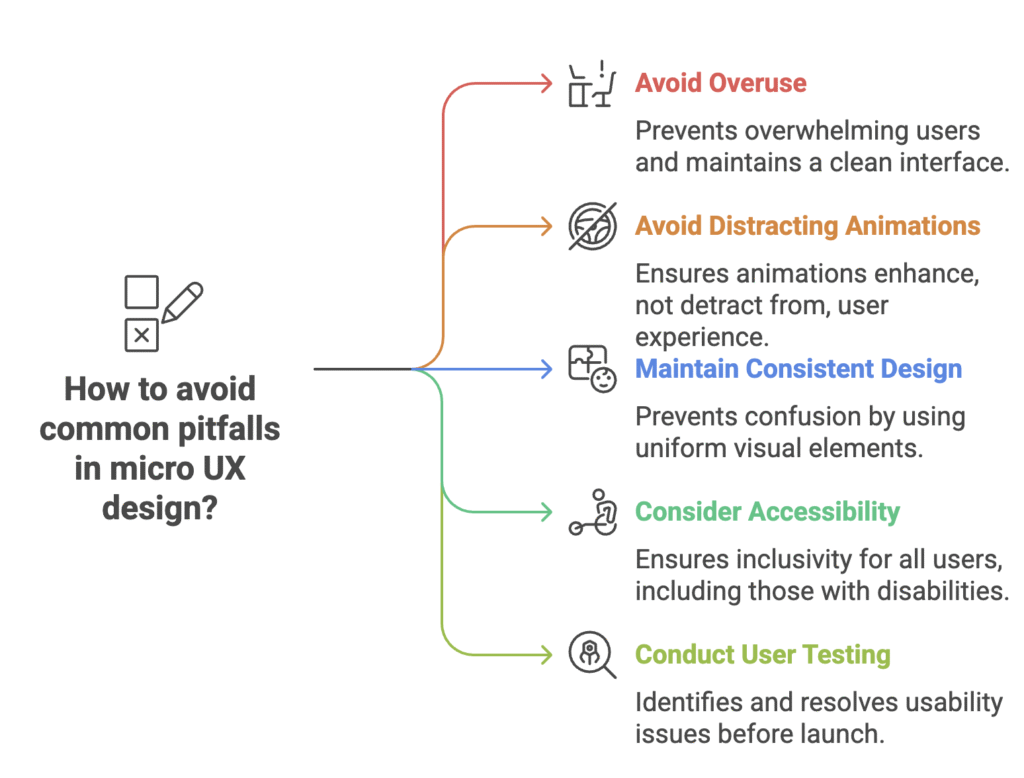
Common Pitfalls to Avoid
Key Takeaways
- Micro UX = Big Impact: Small, explicit design elements can simplify, clarify, and beautify memorable digital experiences.
- Purpose First: Each micro-interaction should serve a purpose, such as helpful feedback, orientation, or sheer delight.
- Consistency: Similar actions should use the same style and animations and utilize similar cues for familiarity.
- Accessibility: Enable micro-interactions that work for everyone, including users with disabilities.
- Don’t Overdo It: Facilitate clutter by cramming too many micro-interactions into the interface and annoying users.
- Test with real users: Always validate micro UX designs to ensure they are providing a positive (and not negative) experience.
Conclusion
Micro UX elements are remarkably effective for improving user experience. If you are mindful about their value, context, and design, you’ll be able to make efficient, impactful, and pleasurable micros that can keep users happy. Use the abiding principles of a micro UX element which are simple, clear, consistent, and accessible.
Last but certainly not least, test your micro UX elements with real users to see if they work for them. By focusing on micro UX elements, you can help to create an interface that is both usable and enjoyable!
FAQs
1. What is the difference between UX and Micro UX?
UX is about the entire user experience, while Micro UX is about small, single-purpose design elements that improve particular engagement within that experience.
2. Are micro-interactions only visual?
3. How do micro-interactions make things more usable?
4. Can micro UX elements affect a website or an app speed?
5. What tools can I use to design micro-interactions?
6. How can I make sure my micro-interactions are accessible?


