
Great writing deserves to be read. But poor typography can turn even the best story into a struggle.
Fonts aren’t just decoration, they’re the invisible guide that shapes how easy (or hard) your book is to read. The right typography keeps readers immersed. The wrong choice causes frustration, fatigue, and quick exits.
Whether you’re self-publishing or going through a traditional publisher, smart font choices and thoughtful layout can make your book not only look great, but feel great to read. Here’s how to get it right.
In this blog, you’ll discover which fonts actually work and why thoughtful typography can be the difference between a book that gets read and one that gets ignored.
Typography in Book Layout: Why It Matters?
Typography is one of the most important and underrated, parts of book design. It’s not just about choosing pretty fonts; it’s about guiding the reader’s eye, setting the tone, and making your content effortless to consume.
- Typography impacts reading speed and comprehension.
- The right fonts keep readers focused and engaged.
- Good typography enhances professionalism and credibility.
- Fonts help set the emotional tone and genre expectations before readers begin.
Want your book cover to complement your typography? Don’t miss our guide on how to design a book cover that sells.
Key Typography Elements That Affect Readability
To create a comfortable and engaging reading experience, these are the core elements to pay attention to
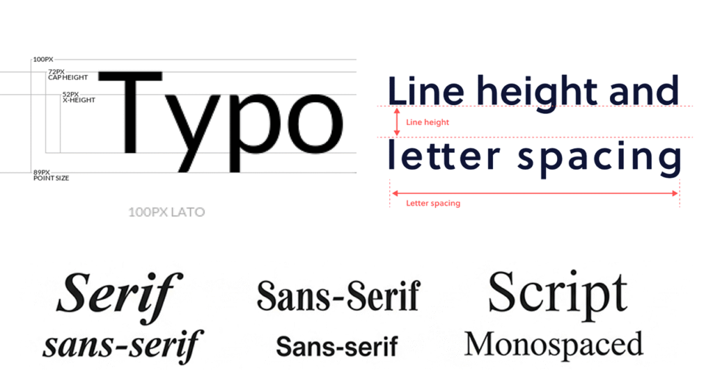
Font Type
- Serif fonts (like Garamond or Baskerville) are traditionally easier to read in printed books.
- Sans-serif fonts (like Helvetica or Lato) are clean and modern, often used for digital formats or headings.
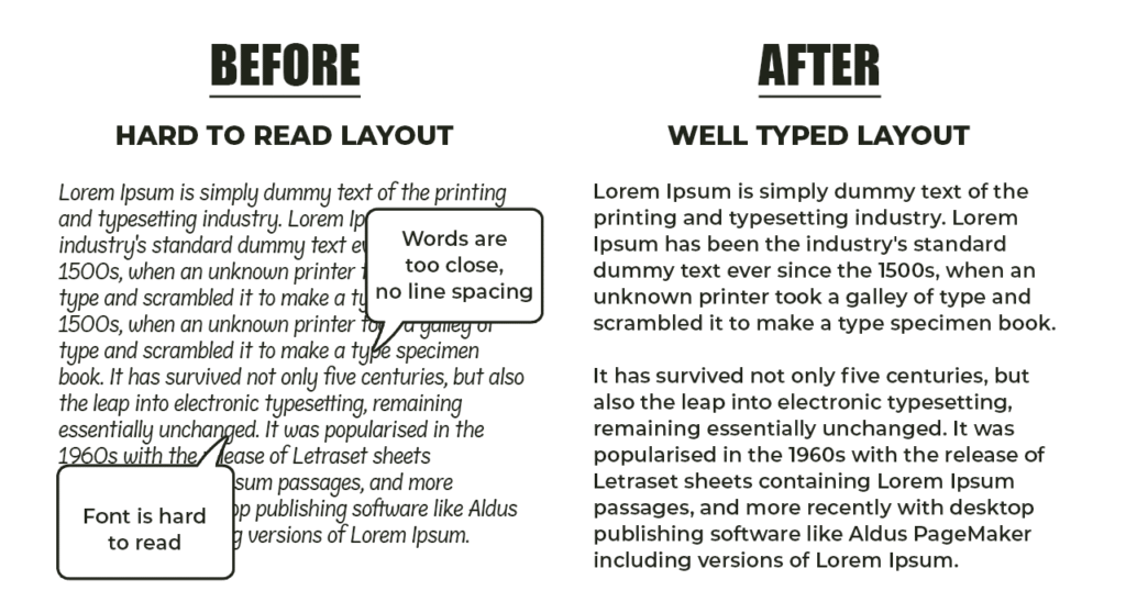
Font Size & Line Spacing (Leading)
- Body text typically works best between 10–12 pt.
- Line spacing should be 120–145% of the font size to avoid a cramped look.
Line Length & Margins
- Ideal line length is 50–70 characters.
- Wide margins improve readability and give the layout breathing room.
Kerning & Tracking
Your words deserve to be read effortlessly. Don’t let poor typography turn readers away, let Design Shifu help you craft a book layout that’s polished, readable, and designed for your audience. View our portfolio
Best Fonts for Typography in Book Layout
Choosing the right fonts is essential for readability and aesthetics. Your font choices set the tone and help keep readers immersed in your content.
Serif Fonts for Body Text
| Font | Style | Best For |
| Garamond | Classic, elegant | Historical fiction, literary works |
| Baskerville | Sharp, formal | Memoirs, nonfiction, essays |
| Georgia | Digital-friendly | Both print and eBook body text |
| Caslon | Traditional, soft | Biography, memoirs |
| Palatino | Friendly, balanced | General fiction |
Sans-Serif Fonts for Titles & Headings
| Font | Style | Best For |
| Helvetica | Clean, neutral | Modern nonfiction, business books |
| Futura | Geometric, bold | Design books, modern genres |
| Lato | Warm, professional | Self-help, inspirational books |
| Montserrat | Modern, structured | Digital books, eBooks |
| Open Sans | Simple, friendly | Both print and digital subheads |
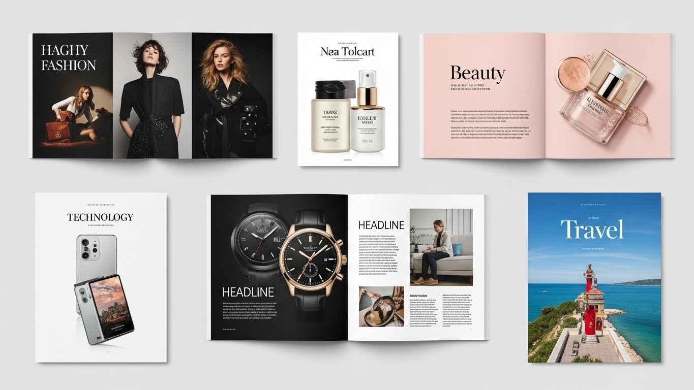
Real-world examples of typefaces used in publishing
Typography in Book Layout: Matching Font to Genre
- Pair a serif font for the body with a sans-serif for headers to create contrast and hierarchy.
- Avoid pairing fonts that are too similar, it can feel redundant or clash visually.
- Use no more than two font families to maintain a clean, cohesive design.
Your words deserve to be read effortlessly. Typography and layout are key to a high-converting book covers. Don’t let poor typography turn readers away. let Design Shifu help you craft a book layout that’s polished, readable, and designed for your audience View our portfolio →
Common Mistakes to Avoid in Typography
Even great content can feel amateurish if the typography goes wrong. Avoid common design mistakes that hurt your book’s success.
Common Typography pitfalls to Avoid
| Mistake | Why It Hurts Readability | What to Do Instead |
| Using decorative fonts for body text | Hard to read at length, causes eye fatigue | Stick to clean serif or sans-serif for body |
| Too many font styles | Creates chaos and distracts readers | Limit to 1–2 complementary fonts |
| Tiny font size and tight spacing | Cramped look, difficult to follow | Use 10–12 pt size, 120–145% line spacing |
| Not testing at print scale | On-screen previews don’t match print output | Always proof at actual print size |
| Poor contrast between text and background | Reduces readability, especially at thumbnail sizes | Maintain high contrast, especially for digital reading |
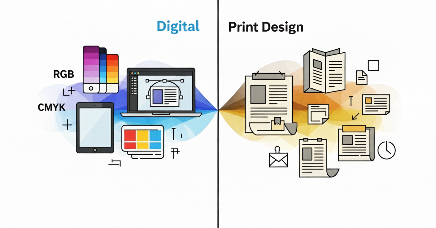
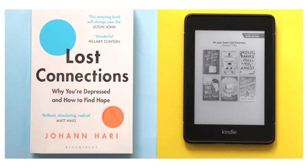
Typography in Book Layout for Print vs. Digital Books
Typography behaves differently depending on format. A layout that works for print may not translate perfectly to digital and vice versa.
Print Design Considerations
- Fixed layout: You control exactly how the text appears.
- Fonts must be readable at actual printed size
- Manage leading, margins, and hyphenation carefully.
- Test for readability in both bright light and low light.
Optimizing Typography in Book Layout for eBooks
- Reflowable layout: Readers can resize fonts and change settings.
- Choose fonts that scale well and maintain spacing (like Georgia or Lato).
- Avoid layouts that rely heavily on fixed spacing.
- Be aware of device overrides (Kindle, Apple Books).
Physical book layout with fixed margins and justified text, and a digital e-reader with reflowable text.
Should You Hire a Professional?
When to DIY and When to Hire
If you have an eye for design and understand layout principles, DIYing your book’s typography can work—especially for personal projects or eBooks. But when your goal is professional quality, wide distribution, or high sales potential, hiring a designer is worth the investment.
What a Professional Brings to the Table
- Deep knowledge of typography, layout rules, and reader behavior
- Experience formatting for both print and eBook platforms
- Tools and templates that ensure precision and consistency
- Awareness of genre-specific design trends
Conclusion
Typography might be silent but it speaks volumes.
From setting the tone of your story to influencing how long readers stick around, it’s a vital part of your book’s success. Thoughtful type choices make your content not only beautiful but readable, trustworthy, and professional.
Your words deserve visuals that match their impact partner with Design Shifu for sleek, genre-appropriate graphics that make your Book unforgettable.
Typography Checklist for Better Readability
Fonts
- Genre-appropriate serif or sans-serif fonts selected
- Font pairing limited to 1–2 families
- Readability tested at actual size (print and eBook)
Layout
- Body text size between 10–12 pt
- Line spacing at 120–145% of font size
- Line length between 50–70 characters
- Wide enough margins for comfortable reading
Technical
- Kerning and tracking adjusted for balance
- Print-ready files proofed for bleeds, margins, and hyphenation
- eBook typography optimized for reflowable formats
Frequently Asked Questions
What is the ideal font size for a printed book?
Typically, 10–12 pt is optimal for body text in printed books, varying with the used font and trim size.
Are serif fonts more readable?
Yes, particularly in printed books. The small strokes (serifs) assist in directing the reader’s eye along every line.
How many fonts should you use in a book?
Limit to two maximum one for body copy and one for headings. Too many fonts will distract the reader and look amateurish.
Can I use free fonts in my book?
Yes, but always check you read the terms of licensing. There are free fonts that are not allowed for commercial purposes or print distribution.
Should I use justified or left-aligned text?
Justified text is used more frequently in print for a clean, professional look. Left-aligned can be more casual in tone and works well for eBooks.
How is kerning different from tracking?
Kerning tweaks space between individual letters, while tracking tweaks spacing within a complete word or group of text.
Do fonts look different in eBooks versus print?
Yes! Fonts can be replaced by devices or enable readers to replace them, so the scalable, adaptive fonts such as Georgia or Lato should be used in digital versions.
Can I mix serif and sans-serif fonts in my book?
Yes, pairing serif for body text and sans-serif for headings creates contrast and improves readability.
How important is font licensing for books?
Extremely important. Always check licensing especially for commercial print. Many free fonts aren’t allowed for resale or distribution.