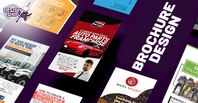
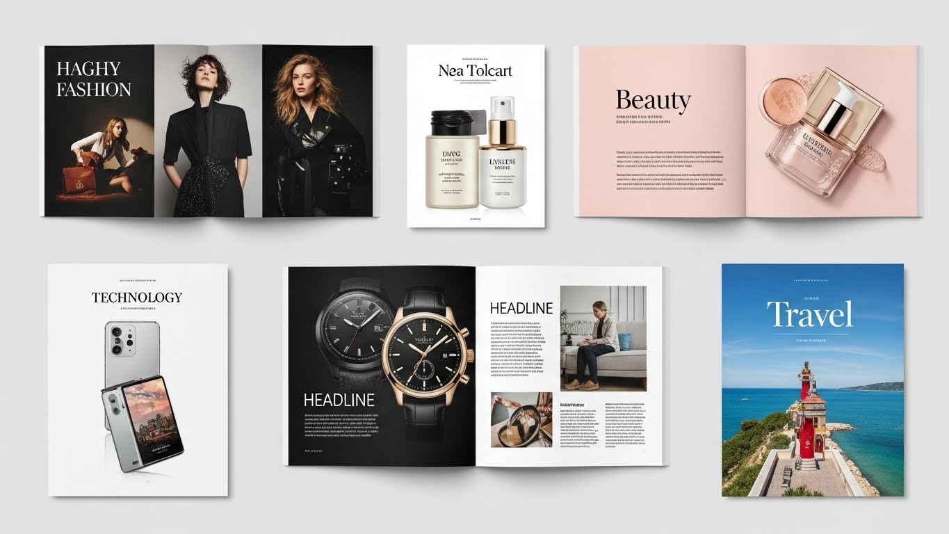
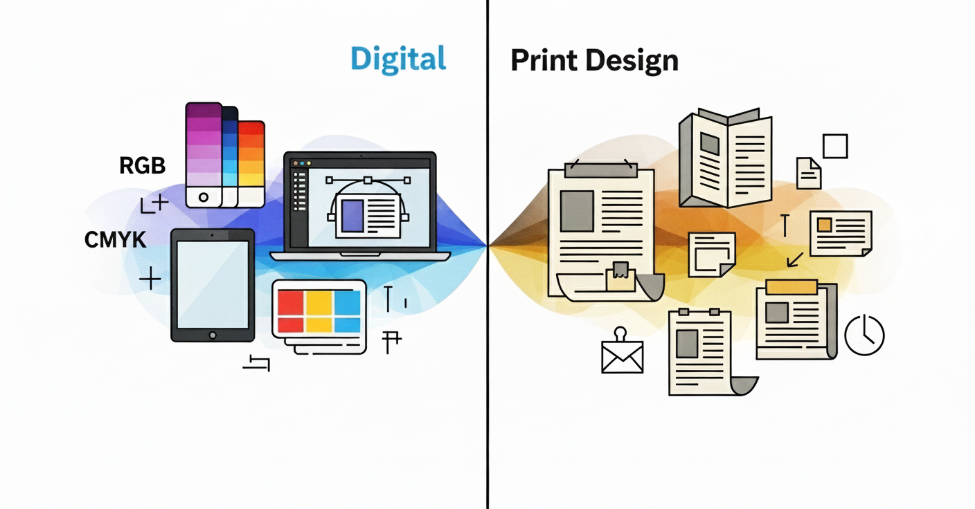
Looking to create a brochure that takes attention and has an impact? Learning the design tips on making a brochure which balances creativity and functionality is most crucial to create an impact. Be it launching a product or giving your brand a revamp, the given crucial design tips will make it easier to write a brochure not just to impress the senses, but one which can clearly put forward its message. So let’s get it done!
Follow these helpful tips to design a brochure that stands out from the crowd.
1. Define its purpose
The first step is to decide what you want the brochure to do. Is it to highlight a specific product or service? Is it more of a ‘look book’ to visually showcase what you do? Who is your target audience and what information would they expect to see when they open it?
Keep the end purpose in mind and design for the reader, not for yourself. The key is to ensure the brochure design reflects the message you are trying to convey and is not diluted by including too much information.
2. Choose your fonts wisely
Whether you are starting from scratch or using a template, when it comes to brochure design, it is important to keep fonts simple and clear. You do not have to try and find a font that nobody else has used before. If you already have brand guidelines in place, then they will guide your design.
However, if you are designing something completely new, try sticking to just heading, sub-heading, and body copy fonts. Incorporating too many fonts can detract from the brochure design and make it hard for the design to flow throughout the entire publication.
3. Choose your print stock
Once you have your brochure design artwork finalized, you will need to choose what kind of paper it is printed on. There are so many to choose from so it would be a good idea to collect samples of various other brochures and see which one has the right ‘feel’ for your brochure.
You will need to consider several things such as paper density, finishes and color. Your front and back covers can also have different finishes to the internal pages.
Here’s a helpful brochure fold comparison chart from PrintPlace
4. Proof it and then proof it again
Whilst a picture can speak a thousand words, typos and grammatical errors can say a lot about your business too. Good copy is often the most undervalued element in brochure design. If writing is not your strong point, consider getting a copywriter to assist you.
A good copywriter can take your basic ideas and concepts and turn them into a compelling story. Once the copy is agreed, ask a fresh pair of eyes to read it through for you; someone else reading text for the first time can often spot things you might miss.
5. Get to the point
As a business owner, your gut instinct may be to try and tell readers absolutely everything that you do. People very often only skim through the text, so be sure to make a very literal statement about what you want to say.
Strong headings and sub-statements in brochure design should make it easy for the reader to quickly understand what it is you do. Strong images can also accompany the text to get a point across.
6. Do not try to reinvent the wheel
Whilst you may want to make your brochure design distinctive, trying to be too different or unconventional may have an adverse effect. There is a reason why many of the same fonts are used repeatedly in brochure design worldwide; for example, Helvetica and Roboto are popular for body copy whilst Garamond and Rockwell are trusted options for headlines.
7. High resolution images
Poor quality images have the power to undo all your hard brochure design work. Fact. Images should be easy to interpret, sharp and clear. If you cannot afford a photoshoot yourself, then stock images may be your only option. However, try to avoid ones that have been overused by other businesses in the past and focus on those that do not look like staged images.
If designing a brochure from scratch still feels like an uphill task, then why not contact the professional team at DesignShifu? We are ideal for individuals and businesses of all sizes. Our flat rate graphic design service offers affordable, fast, and professional brochure design, supported by a 14-day 100% money-back guarantee.
Click here to find out more about our various subscription plans.


