
In the fast-paced world of SaaS, standing out isn’t just about product features—it’s about branding. As your product scales, so does your team, your customer base, and your marketing ecosystem. This is where brand guidelines design for B2B SaaS teams becomes a game changer.
Your brand guidelines are more than a style sheet—they’re a roadmap for how your brand speaks, looks, and feels. When executed well, they allow marketing, product, sales, and design teams to collaborate without breaking brand consistency.
TL;DR
Brand guidelines help B2B SaaS teams maintain a consistent visual and verbal identity across touchpoints.
They define logo usage, typography, color palette, voice, and asset management—empowering designers, marketers, and product teams to collaborate efficiently and scale brand trust across channels.
What Are Brand Guidelines?
Brand guidelines (also called brand books or style guides) are a set of rules and standards that define how your brand should be represented across all channels—internal and external. They cover visual elements (logos, colors, typography), brand voice, usage rules, and downloadable assets to ensure cohesion across teams and mediums.
Why B2B SaaS Teams Need Brand Guidelines

- Consistency across platforms: SaaS companies operate across web, product UI, email, paid ads, and social. Guidelines ensure that no matter the platform, the brand looks unified.
- Faster onboarding: New hires or external partners (like freelance designers or agencies) can understand and implement your brand without constant supervision.
- Scalability: As you add more products or markets, your brand doesn’t get diluted—it evolves intentionally.
- Customer trust: A consistent brand builds credibility. When customers recognize your style and tone, they’re more likely to trust and engage with your software.
Essential Elements of SaaS Brand Guidelines
1. Visual Identity System
- Logo variations (primary, secondary, icon-only)
- Clear space and misuse examples
- Color palette with hex/RGB codes and accessibility ratios
- Typography (fonts, weights, and usage examples)
Explore our blog on visual identity system for detailed explanation
2. Brand Voice and Messaging
SaaS brands need a voice that’s clear, helpful, and confident. They benefit most from a conversational, confident, and helpful tone—one that feels human but still authoritative. Your tone should reflect your product’s complexity level and the user’s emotional state when they’re interacting with you (exploring, onboarding, troubleshooting, etc.).
Tone breakdown
- Professional – Polished and respectful, but not robotic. Great for enterprise SaaS.
- Conversational – Friendly and approachable. Ideal for SMB or freemium models.
- Witty (optional) – Adds personality, but use it selectively—especially in UX microcopy or social posts.
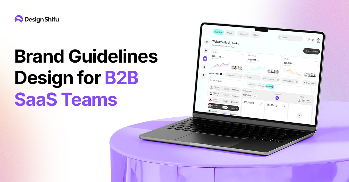
3. Product UI Guidelines
Many SaaS brands overlook this!
1. UI/UX Color Usage
Color is more than aesthetics—it guides behavior, sets emotional tone, and improves usability.
Key Considerations
- Use a consistent primary palette aligned with your brand’s emotion (e.g., blue for trust, green for growth, purple for creativity).
- Incorporate meaningful color contrast for accessibility (especially for buttons, alerts, and error states).
- Assign functional colors: green for success, red for error, yellow for warnings—used consistently across the UI.
Example: Slack uses soft purples and cool neutrals to feel calm and professional, but not stiff.
2. Typography Inside Your App
Good typography improves scannability, comprehension, and visual hierarchy.
Key Considerations
- Choose a legible font optimized for screen (e.g., Inter, Roboto, Open Sans).
- Establish a typographic scale (H1 > H2 > H3 > body > caption) to make screens easier to navigate.
- Avoid using too many font families—stick to 1–2 max for a clean, unified look.
Example: Notion uses a minimalist typographic hierarchy that supports user content without overpowering it.
3. Iconography Rules
Icons can quickly convey meaning, but inconsistent or unclear icons create confusion.
Key Considerations
- Maintain visual consistency (stroke weight, corner radius, size) across all icons.
- Use universally recognized symbols (e.g., trash for delete, gear for settings) to minimize learning curve.
- Avoid decorative icons without purpose—every icon should aid comprehension or enhance usability.
Example: Figma’s icons are clean, intuitive, and feel “native” to their design-savvy audience.
4. Interaction or Micro-animation Styles
Micro-interactions make the interface feel responsive, human, and alive—they provide feedback and build emotional connection.
Key Considerations
- Add loading animations that reassure users the system is working.
- Use subtle hover effects, button press feedback, and smooth transitions to guide the user intuitively.
- Don’t overdo it—animations should support usability, not distract from it.
Example: Airtable’s animations are fluid and minimal, reinforcing the feeling of a polished product without slowing down user flow.
These visual and interactive details form your product’s personality. They’re not “nice to have”—they’re core to user trust, satisfaction, and even conversion.
Need help auditing or designing your app’s visual system? You can work with unlimited design services like Design Shifu to create UI assets, icon sets, color schemes, and more—tailored for SaaS success.
4. Content and Social Media Guidelines
To ensure your brand voice stays consistent across every touchpoint, from blog posts to social media captions, these guidelines define how your content should look, feel, and sound. Whether you’re writing a blog, posting on LinkedIn, or crafting an email, these standards will help your team communicate clearly, stay on-brand, and engage your audience effectively.
Blog Headers, Image Styles, Post Formats
To maintain brand consistency across your blog, it’s essential to define the structure and aesthetics of your content:
- Headers: Establish a clear hierarchy (H1 for titles, H2 for sections, H3 for sub-points) with consistent font sizes, weights, and spacing. Stick to your brand’s tone—whether punchy and minimal or detailed and professional.
- Image Styles: Use a uniform image treatment (e.g., rounded corners, branded overlays, consistent filters). Decide whether images are illustrations, product-focused, or lifestyle-based. Align these with your visual identity.
- Post Formats: Define if your posts are listicles, tutorials, thought leadership pieces, or deep dives—and keep formatting consistent (e.g., intro, bulleted takeaways, bolded subheadings, and CTAs at the end).
LinkedIn, Twitter, Email Formatting
Content formatting varies by platform, so it’s important to tailor accordingly:
- LinkedIn: Use 1-2 line paragraphs for scannability. Start with a hook. Use emojis as bullets sparingly. Hashtags should be 3–5, industry-specific, and placed at the end.
- Twitter/X: Keep it concise and punchy. Break threads into single thoughts per tweet. Use bold visuals or memes sparingly and intentionally. Branded hashtags are effective here.
- Email: Use short subject lines and preview text that teases value. Inside, break copy into digestible chunks with strong CTAs. Use your brand’s email signature, header images, and consistent tone (formal/informal) for a cohesive look.
Brand Hashtags and Emojis
These add personality and discoverability to your content
- Brand Hashtags: Create a few signature hashtags (e.g., #ShifuDesignTips or #BuiltWithShifu) to unify campaigns and user-generated content. Use them consistently across posts.
- Emojis: Choose a set that aligns with your tone (e.g., for professional uplift; for energetic brands). Define how often and where they should appear (e.g., in headings, bullets, or posts only—not emails if formal).
5. Brand Assets Management
Centralize all logo files, templates, illustrations, and content assets in a cloud-based system like Notion, Figma, Dropbox, or Brandfolder.
6. Usage Examples and Do’s/Don’ts
- Include mockups for landing pages, presentations, and sales decks.
- Show incorrect logo usage, off-brand typography, and tone violations.
Best Practices for Creating SaaS Brand Guidelines
- Collaborate cross-functionally: Get input from marketing, product, and design teams.
- Make it scalable: Design a system that grows with your team, products, and markets.
- Use modular design systems: Leverage tools like Figma libraries or Adobe CC to sync your visuals.
- Include downloadable assets: Logos, fonts, and templates should be easy to find and use.
- Audit regularly: As your SaaS product evolves, so should your guidelines
How to Get Started with Your SaaS Brand Guidelines
- Audit your existing assets and tone.
- Interview internal teams on usage pain points.
- Use templates or tools like Frontify, Figma, or Notion.
- Start small, then expand—don’t wait for perfection.
- Distribute, educate, and evolve.
FAQs
1. Why are brand guidelines essential for B2B SaaS companies?
They ensure visual and verbal consistency, build trust, and help teams scale marketing and design efforts efficiently.
2. What’s the difference between brand guidelines and a design system?
Brand guidelines define the “why” and “what” of branding, while design systems provide the “how” for digital product UI components.
3. Can small SaaS startups benefit from brand guidelines?
Yes! Even early-stage startups gain clarity and efficiency with foundational brand rules and templates.
4. How often should brand guidelines be updated?
Review them annually or after major rebrands, product launches, or platform expansions.
5. Should product UI branding be included?
Absolutely. The product is part of your brand experience, and should reflect your identity consistently.6. What tools are best for creating SaaS brand guidelines?
Figma, Notion, Frontify, Canva, and Adobe Illustrator are popular choices depending on your team’s workflow.