As a small business owner, you must leverage every marketing medium to spread the word about your business, product, and service. Even though digital marketing has simplified advertising and you can get to masses within budget, some old tried, and tested communication tools like brochures, flyers, and pamphlets still work to date and are a business’s best friend.
The challenge is how to create a brochure that communicates, appeals to, and lands clients.
How can you be confident about your design? We have pulled together a list of successful brochure examples that you may take inspiration from to create a product brochure for your business.
Types of product brochures
The first thing to determine before designing is the layout of your brochure. There are primarily three types of brochures: three-panel, four-panel, and six-panel.
We’ve discussed them in the next section to help you decide the best fit for your small business.
3-panel product brochure
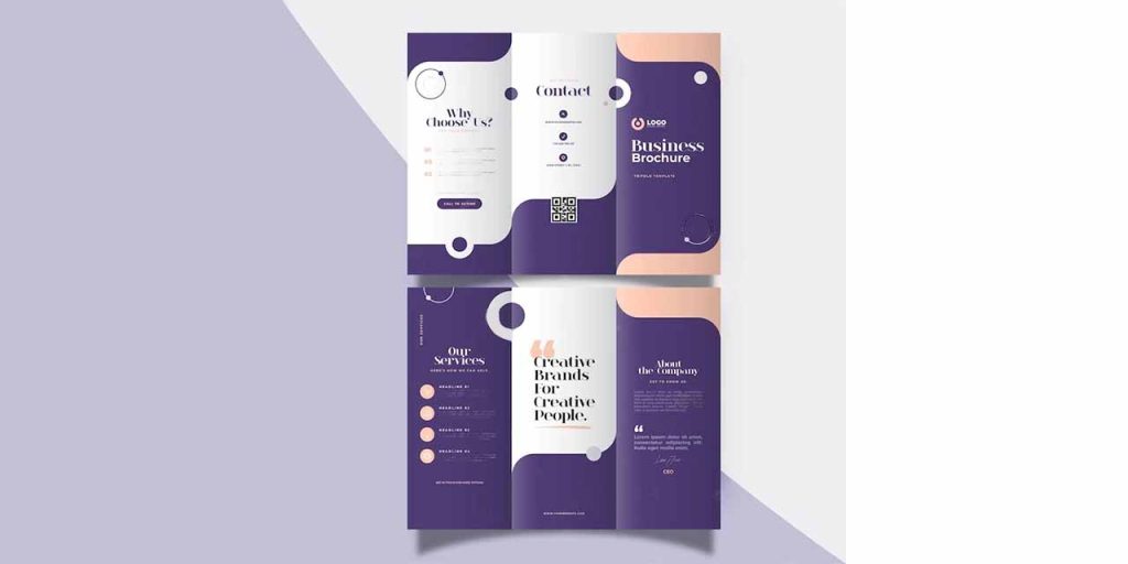
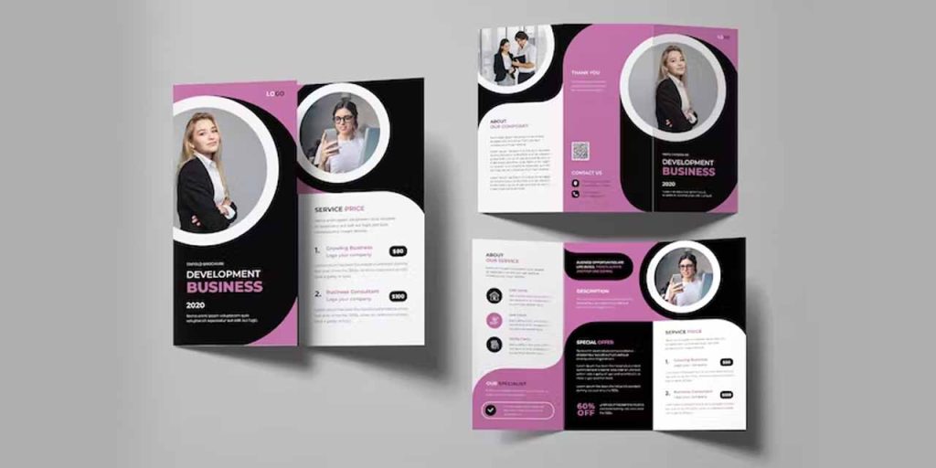
Most businesses use tri-fold brochures for their marketing. It has three front pages and three back pages. Tri-fold brochures have several benefits, including convenience and adaptability. They are not only inexpensive, but they also fit into standard-size envelopes and pockets.
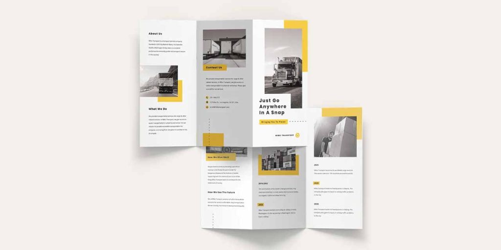
You can assign one page to your contact information, one to the services you offer, one to client testimonials, and so forth. Or you can merge two pages together to focus attention on a certain feature or image.
4-panel product brochure
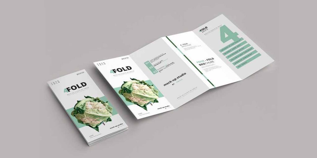
While bifold and 3-panel brochures are perfect for general purposes, if you have more information to share or wish to include a glimpse of your product catalog, 4-panel brochures, with an extra page, allow you to include more information without cramming space so you can include a creative product catalog design.
6-panel product brochure
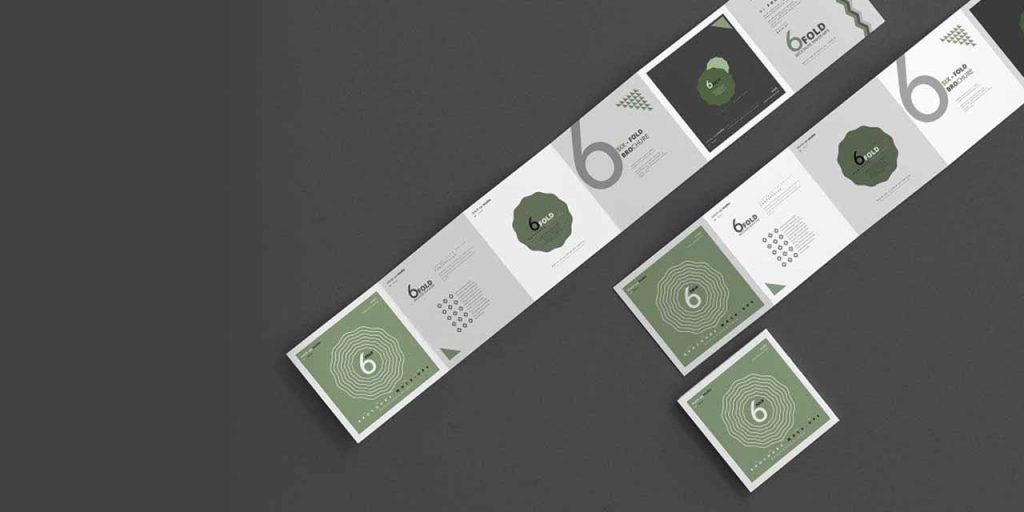
Six-panel brochures are a practical and affordable replacement for booklets for your company’s marketing, training sessions, and trade shows. You can also include step-by-step processes or tutorials in these brochures.
Be creative with the layout and folds to create something unique for the receivers. The most crucial thing is to understand what your company needs. For example, a cafe might only require a tri-fold brochure, whereas a pharmaceutical company might require a 6-fold. Define the content and the parts you want to highlight to determine the number of panels you need.
Now, let’s explore the product brochure design ideas you can use inspiration:
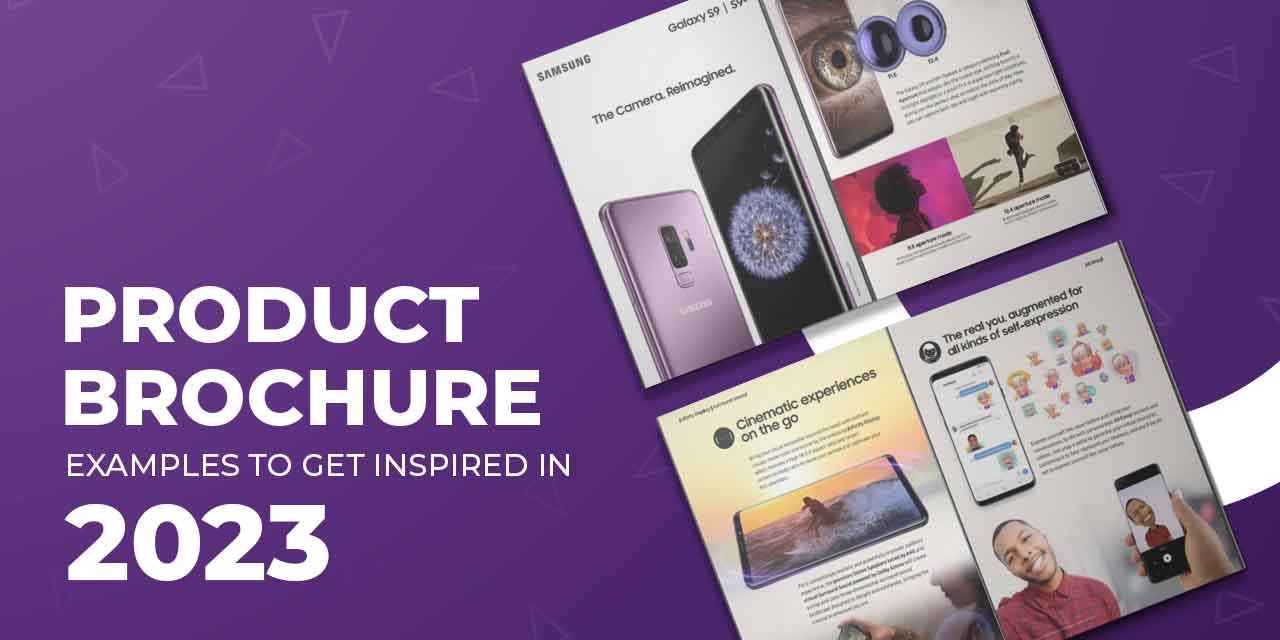
Product promotion brochure
Launching a new product? Create a buzz about it in your town, store, and even online. Use a brochure to highlight benefits and features. Add high-resolution product images to entice your customers. A good way to spread your reach is to notify store visitors about the launch and give them brochures as a giveaway so they can go through it in their spare time. Use visual hierarchy to highlight information and direct your audience’s attention the way you desire.
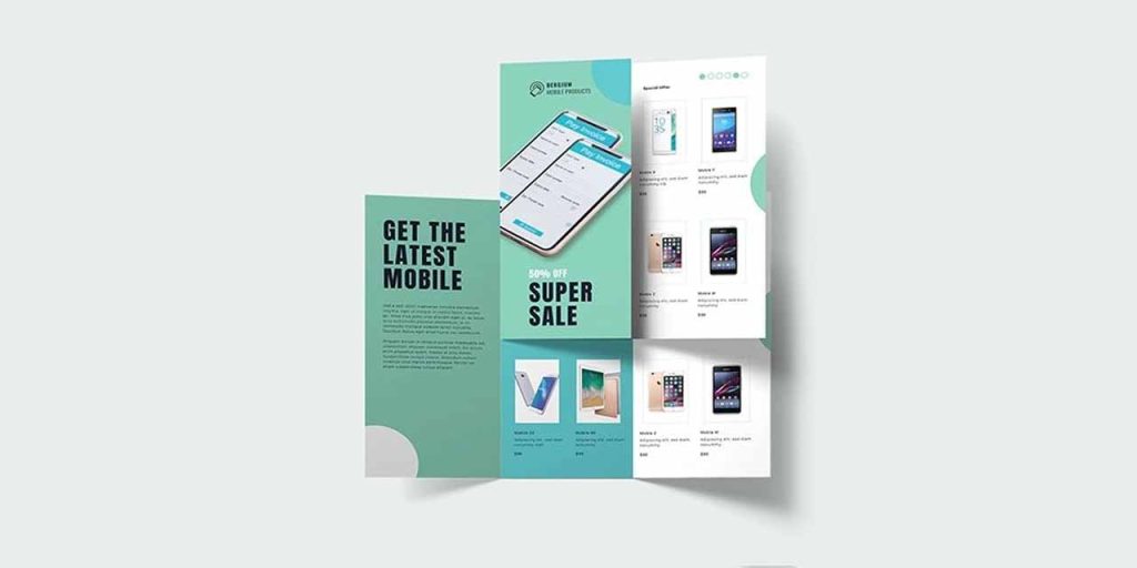
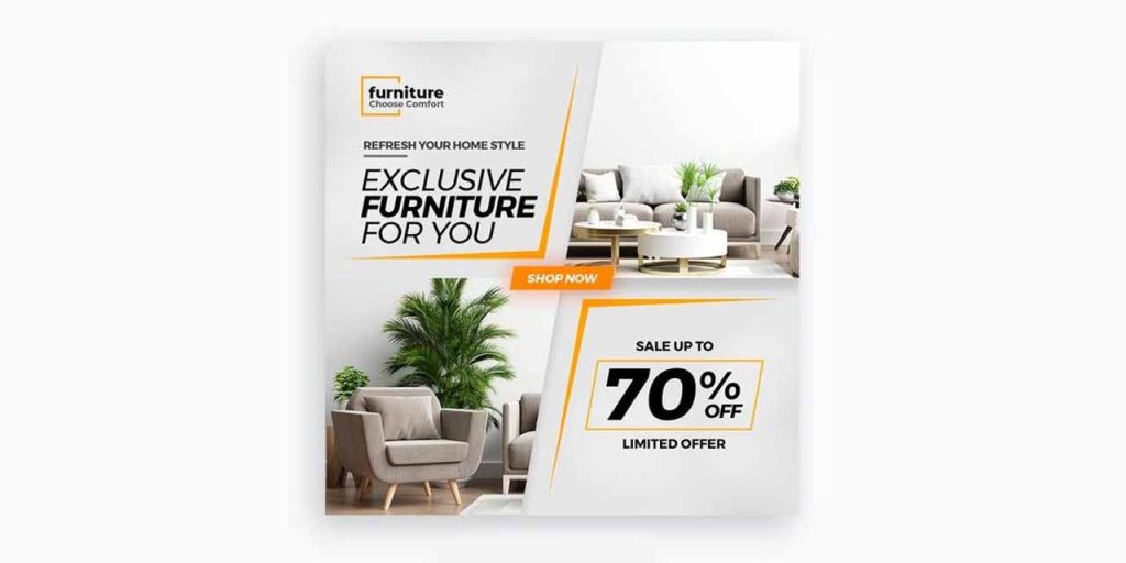
The attention span of consumers is really short. So, the first glance should communicate the value to your potential consumers. If you’re having a limited discount offer or sale for your customers, keep it bold and bright. Let them see it at the first glance to arouse curiosity.
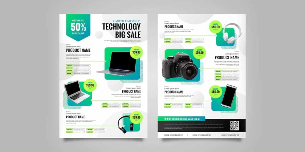
You can use a monochromatic scheme or contrasting color palettes to create visual harmony. If you have more than three products or services to discuss, have enough space between them to make it clear for the reader. Apart from the details of the product launch and exclusive offers, make sure you include a clear CTA. Clutter-free call-to-actions can increase your conversion rate by 232%.
Electronic product brochure
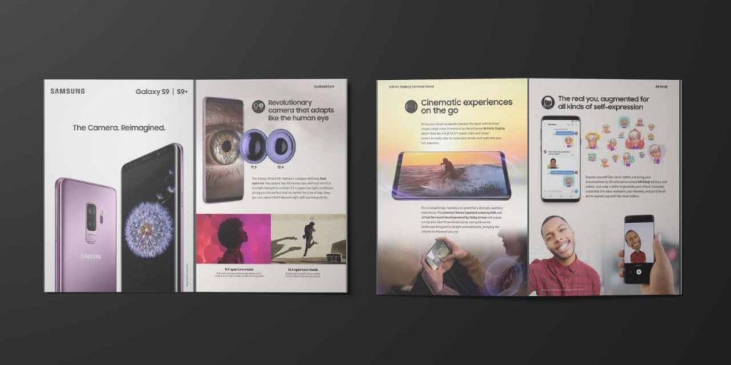
An electronic business deals with technology. Since technology is ever-evolving, the store should exude an innovative and futuristic vision in all its marketing assets. Therefore, the brochure for electronic products must have a cutting-edge design.
Using overlays, newer fonts, and solid and abstract shapes is a great way to market your goods. You can also convert your product images to icons which you can use in other assets too like social media posts, websites, email campaigns, and business cards.
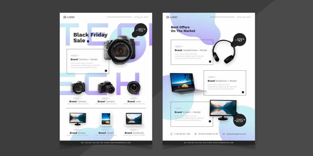
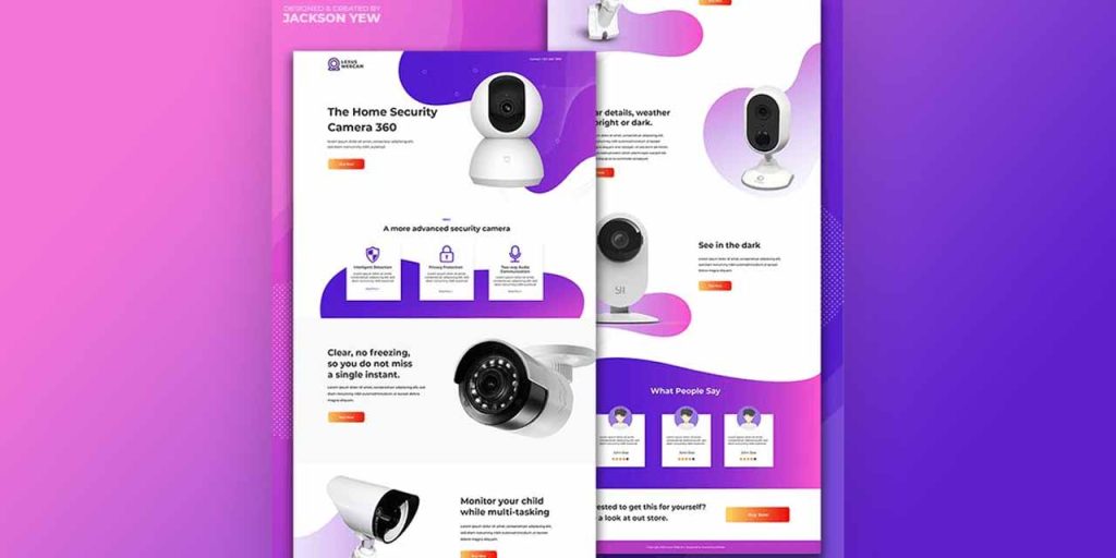
In contrast to how most people market their products, you can identify the doubts and queries of your potential customers and address them in your brochure. If you already have customers, include testimonials and reviews.
Construction brochure
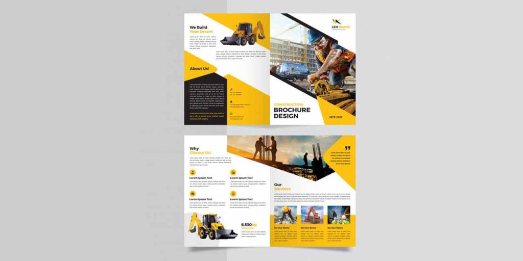
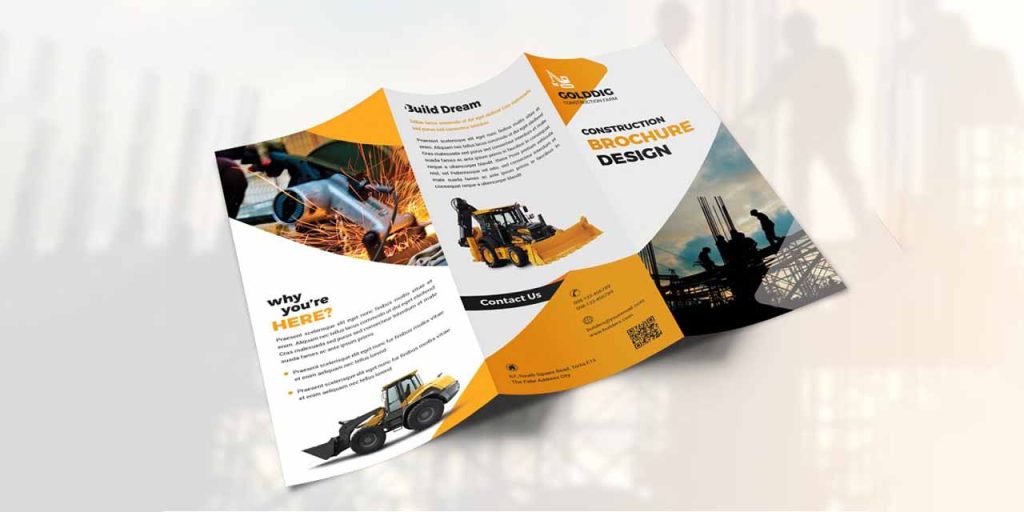
Most construction companies’ logos, brochures, and other marketing materials have black, yellow, and white colors. The bright yellow adds cheer to the strength that black conjures up. Give prospective customers a complete picture of your brand. Include pictures of your team in action to give a glimpse of your process.
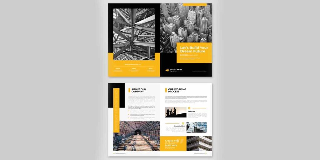
Include brief explanations of what you offer, how things are done, and why they should choose your business over others.
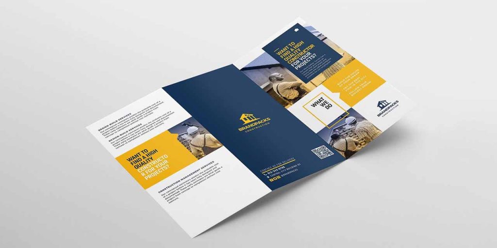
Utilize white space to separate sections and have bold headings and subheadings to separate blocks of text into a pleasing, readable format.
Medical & Pharmaceutical brochure
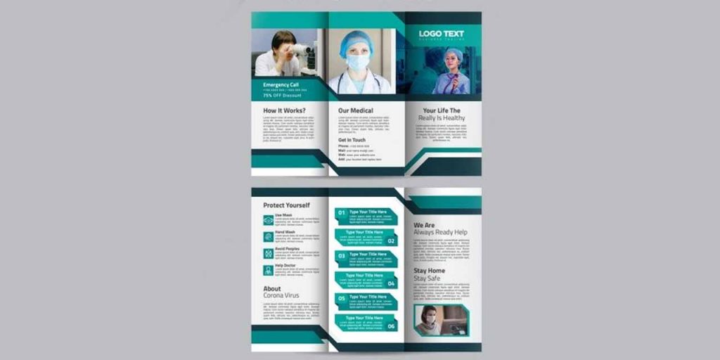
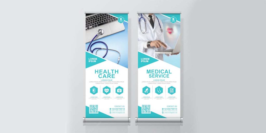
Since green signifies health and generosity while blue color establishes trust and safety, most pharmaceutical and healthcare brochures and centers have blue and green as their primary colors. Include photographs of doctors to spread positivity and assure visitors they are at the right place.
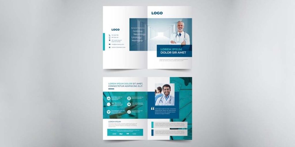
Highlight what you specialize in, your experience, your list of doctors, extra benefits and facilities you offer, and any other detail that would build trust and credibility.
In medical brochures, you can dedicate an entire page of the brochure to contact details.
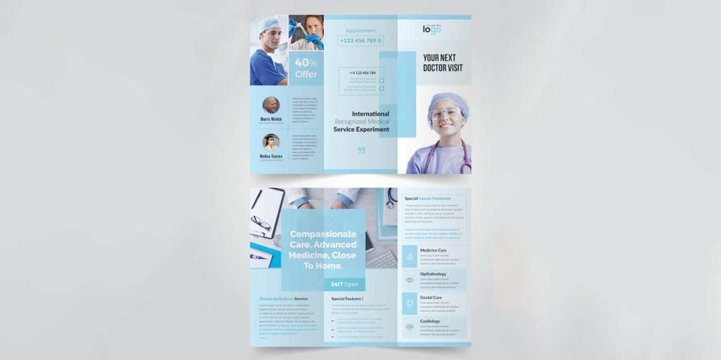
If you create a brochure for your pharmacy, consider including discounts and extra offers like ‘free delivery’ to attract more customers.
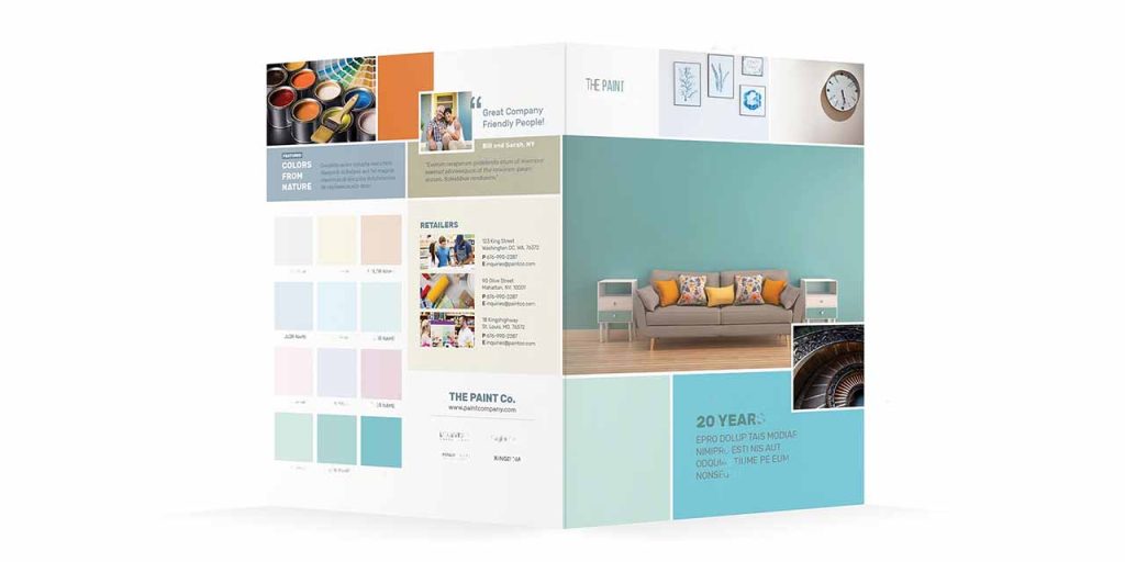
Paint company brochure
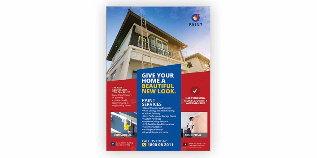
Paint company brochures can be colorful, playful, and cheerful. Add a dash (or more) of color to your brochure. You can experiment with typography, before and after images, and custom illustrations. Include examples of your prior work, testimonials from clients, and the promises you make to them.
Ice cream product brochure
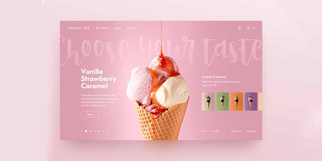
Although most small businesses and corporations opt for formal tones, ice cream businesses can experiment with creative brochure designs. Use your brochure to tap into their senses and showcase your products.
You can choose a minimalist design or a colorful layout. Be sure to use cheery and vivid colors. Some brochure designs use custom illustrations and abstract shapes to give a cute look.
Wine brochure
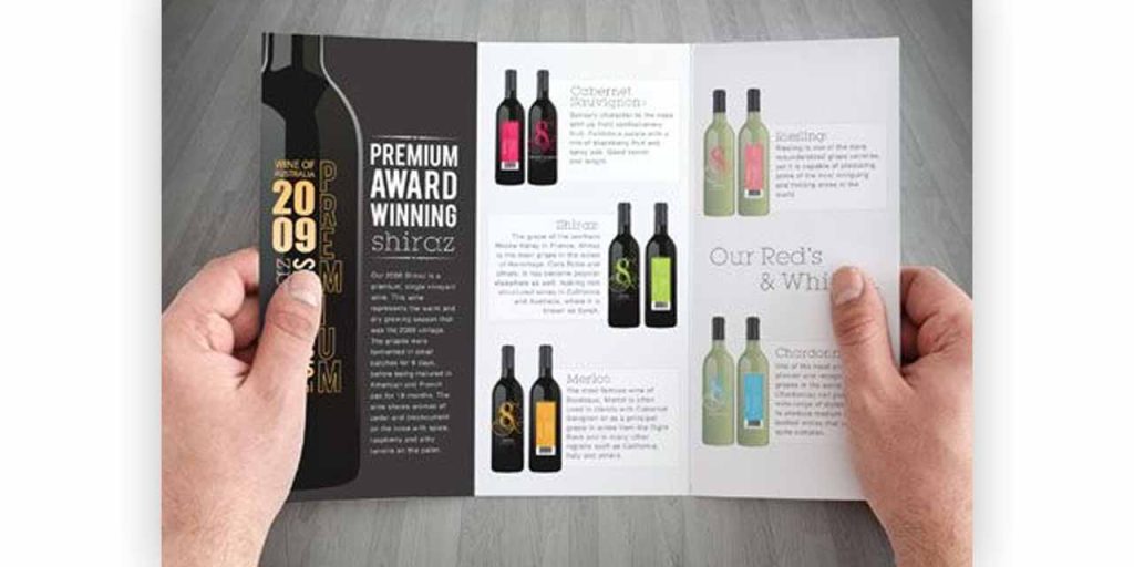
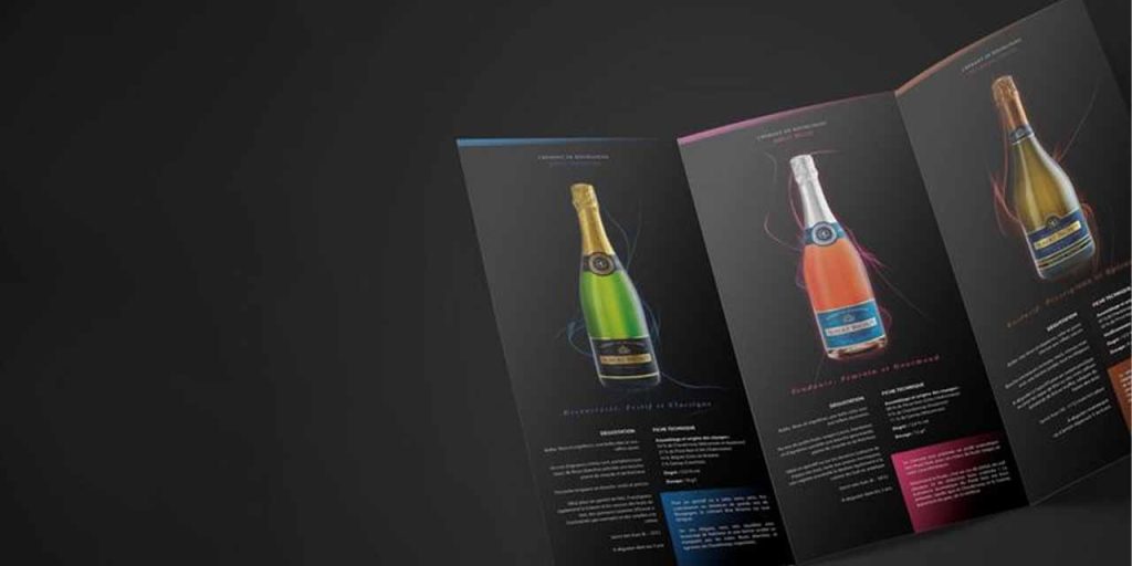
Wine businesses aspire to establish themselves as luxury brands and create an exclusive customer base for their products. Using a minimal layout with dark color themes with a bright highlight delivers the desired tone. It’s a good idea to go with black, silver, or gold. You can also have a creative product catalog design to feature your best-selling products. Businesses also dedicate separate pages for each product to give them a more unique and opulent appearance.
Skincare brochure
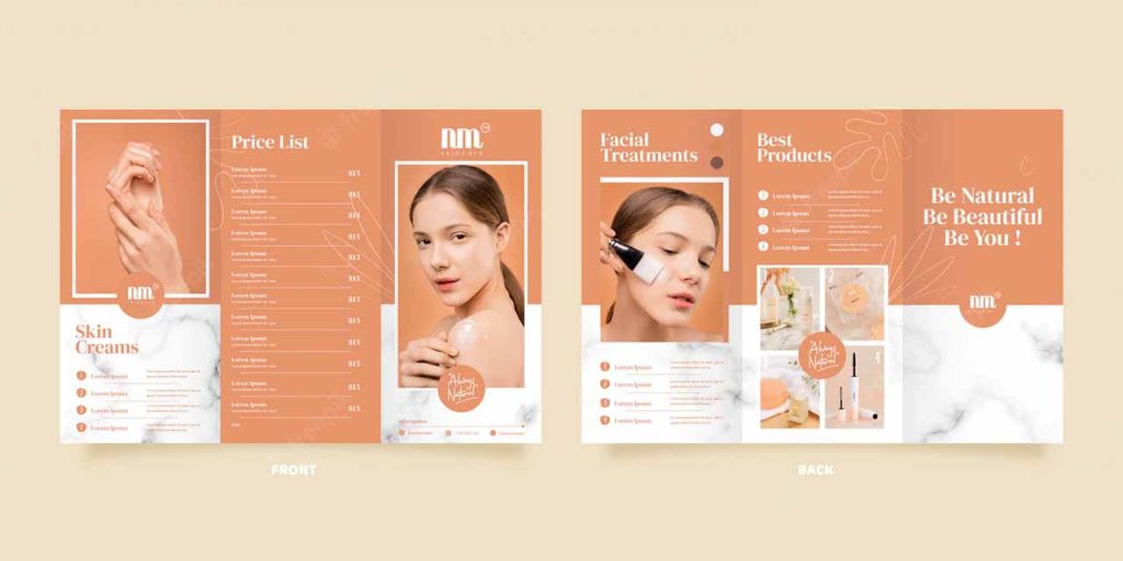
Skincare businesses emphasize aesthetics in their branding. Warm colors like peach, orange, and even skin tones invite readers. Include pictures of your products and how they are used. A picture is worth a thousand words, and more so for skincare brands.
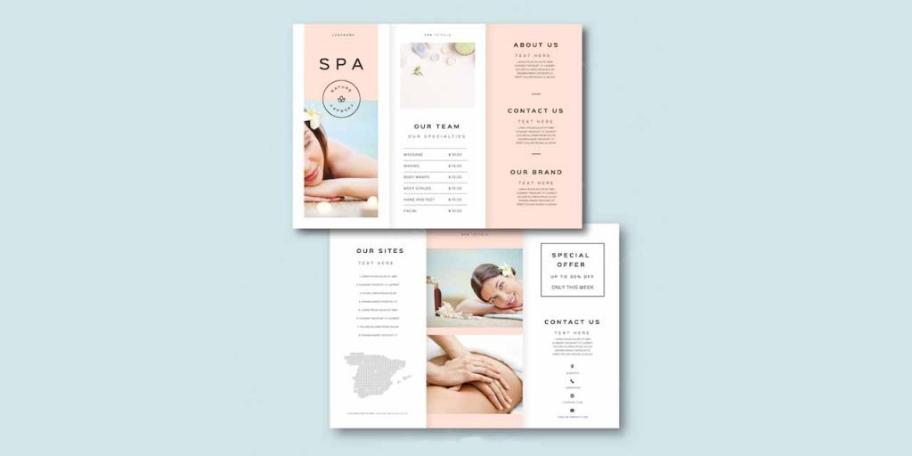
Beauty brands are more about appearance. This is why you should focus on images and visuals. Let customers visualize the end results through quality images.
Furniture brochure
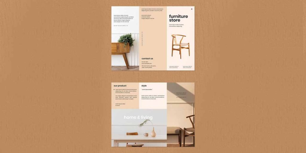
Aesthetics are the main consideration for customers when they consider purchasing furniture for their homes. A company dealing in furniture should design a brochure that aligns with its brand personality. If you sell and renovate vintage furniture items, use design elements that inspire vintage feels and make a brand statement.
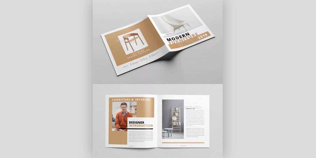
For example, every year IKEA launches a new brochure that features its new collection while keeping it consistent with brand guidelines.
You can also play with the layout. Use a square layout to give a uniform and symmetrical look.
Jewelry brochure
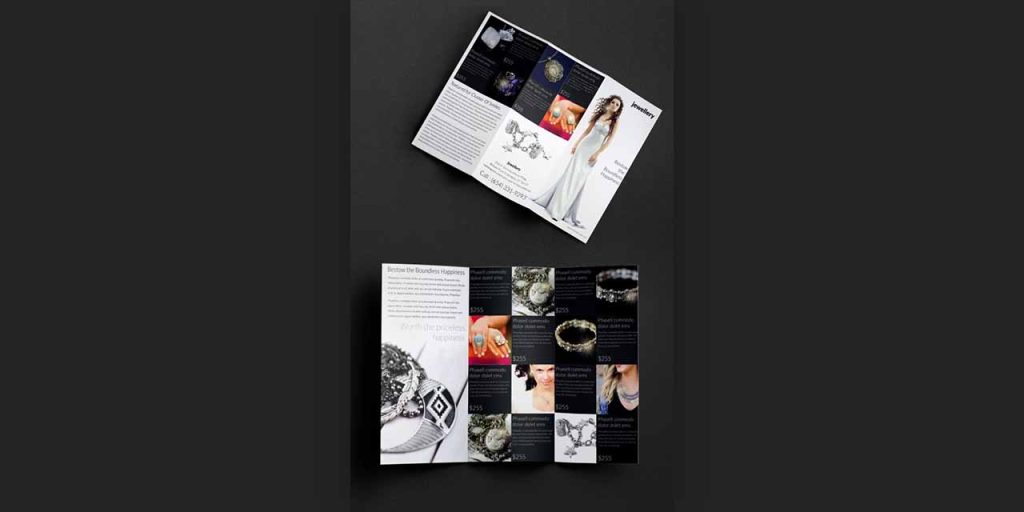
Define the type of jewelry you primarily deal with. Is it handmade jewelry, high-end jewelry, or artificial accessories? What emotions do you want to evoke in your costumes? Pick the layout and style that aligns with your brand messaging. Silver, gold, and black colors are great to use for highlights. Use creative compositions to construct a set for your jewelry pieces in your brochure.
Food product brochure
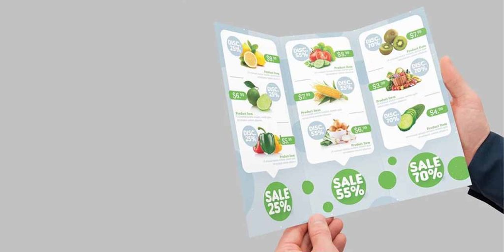
Food product brochures are an excellent marketing campaign strategy to attract customers to your store or restaurant.
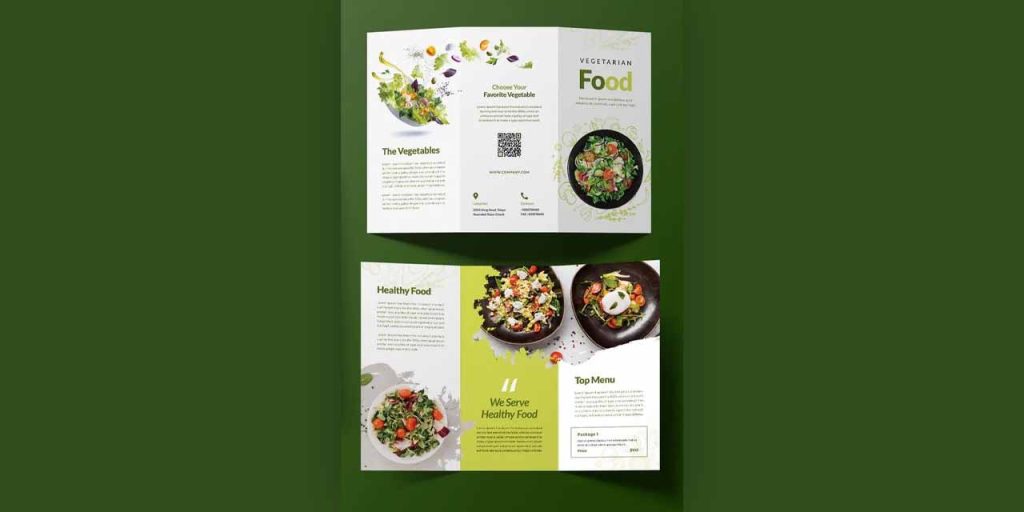
Who is your ideal audience? What are their likes and preferences? What type of food do you sell? Is it a takeaway or a dine-in?
Select colors and typography accordingly. You can use mouth-watering illustrations and product images to tickle their taste buds. Give a glimpse of your menu. If you are running discounts, reward programs, or offering extra services that make you stand out from the crowd, accentuate it.
Handmade brochure
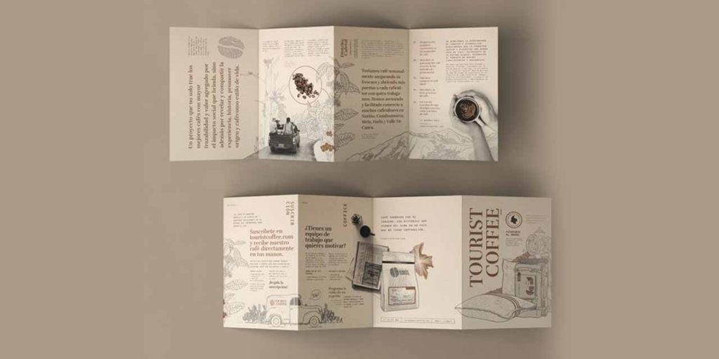
If you’re artsy, why not hand-design your brochure? Use your drawing skills to personalize your brochure and build a warm connection with your first-time visitors.
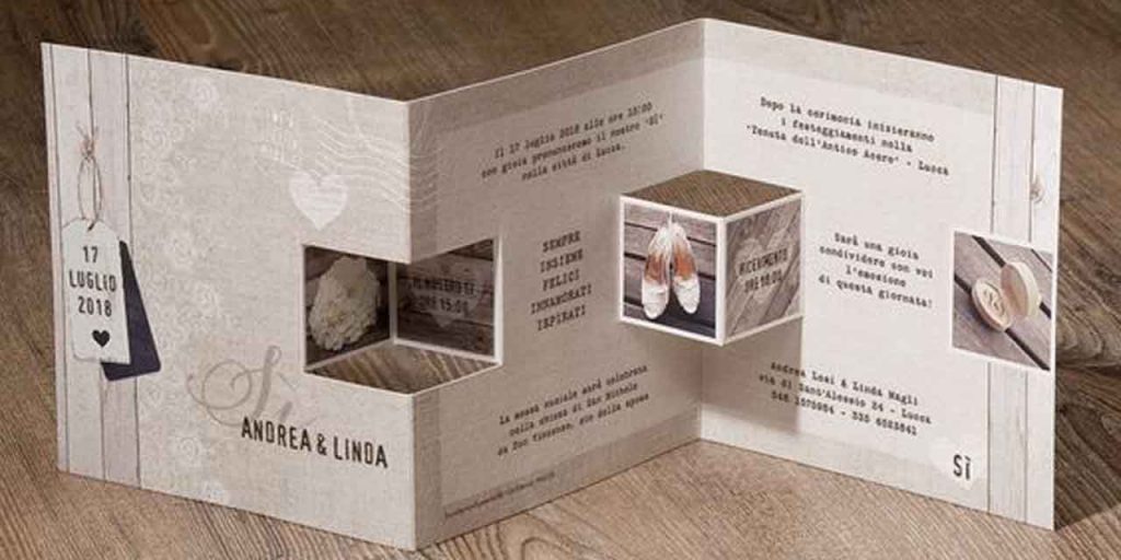
Anything handmade adds warmth and familiarity. You can create simple pencil or pen sketches, drawings, and illustrations to draw viewers in or create a unique typeface for your brand to distinguish it from your competitors. You can also try cutouts and pop-ups to turn your brochure into 3D.
Wrap up
It may seem that product brochures are expensive! While creating one, you have to go through several quality checks and do justice with your brand language, but that doesn’t mean you have to spend a fortune.
Using services like Design Shifu, you can add product brochures to your marketing plan whether you’re just starting out or want to expand your business. We offer unlimited graphic design starting at $399 per month that comes with a risk-free 14 days money-back guarantee. Let’s get started.

