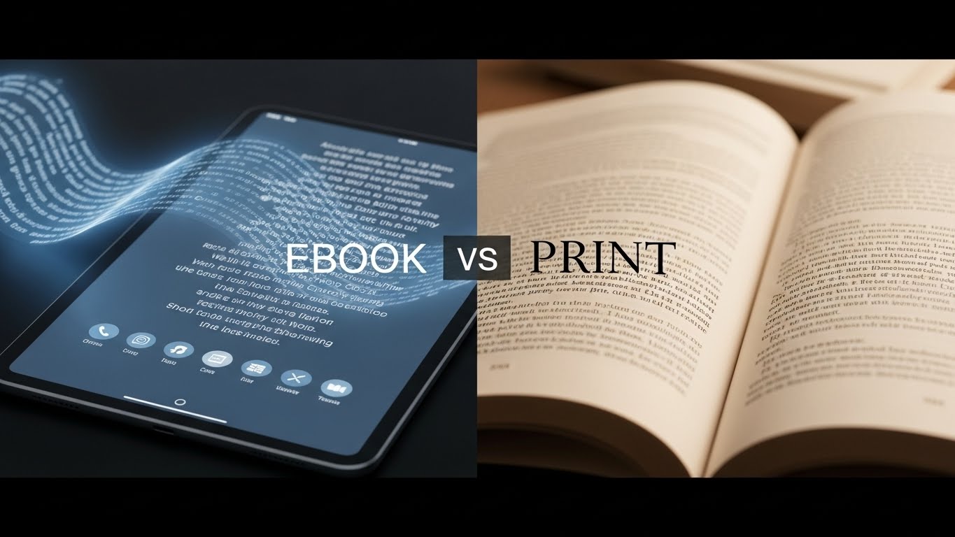

The debate around ebook vs print design goes far beyond personal reading preferences; it directly impacts how your content is experienced by readers. While both formats deliver the same words, the way those words appear, flow, and interact with visuals differs significantly between digital and physical books. To create a professional, reader-friendly experience, your design choices must align with the unique strengths and limitations of each format.
Understanding the core differences between ebook vs print design helps authors, publishers, and marketers ensure their books look polished, readable, and engaging, no matter how readers choose to consume them.
Understanding the Fundamental Differences
Print books offer a fixed, tactile experience where every page appears exactly as designed. Ebooks, however, are fluid text reflows across different devices, screen sizes, and reader preferences. This fundamental distinction shapes every design decision you make.
Print design allows for precise control over typography, spacing, and visual hierarchy. You know exactly where each line break falls and how images align with text. Ebooks sacrifice this precision for flexibility, allowing readers to adjust font sizes, typefaces, and even background colors to suit their preferences.
Typography Choices That Work
Typography is another area where ebook vs print design requires different approaches. Print books benefit from carefully selected serif fonts and fixed point sizes, whereas ebook typography prioritizes system-supported fonts and relative sizing to maintain readability across devices.
For print books, serif fonts like Garamond, Caslon, or Minion Pro provide excellent readability for body text. The high resolution of printed pages renders these traditional typefaces beautifully, with their subtle details enhancing the reading experience. Display fonts for chapter headings can be more decorative, adding personality and visual interest.
Ebook typography demands a different approach. Sans-serif fonts like Arial, Verdana, or Georgia often perform better on screens, especially at smaller sizes. However, many modern reading devices handle serifs well, so the choice becomes less critical than ensuring your font selections are widely supported. Stick to web-safe fonts or common system fonts to ensure consistent rendering across devices.
Body text size in print typically ranges from 10 to 12 points, depending on your font choice and target audience. For ebooks, avoid setting fixed font sizes; let readers control this themselves. Instead, use relative sizing (like percentages or ems) to maintain proper hierarchy between headings and body text.
Layout and Spacing Considerations
Print layout offers creative freedom for asymmetrical designs, generous margins, running headers, and decorative elements. You can use the full spread of two facing pages to create visual impact. Chapter openings might feature large initial capitals, and you can position images precisely where they enhance the narrative flow.
Ebook design requires simplicity. Complex layouts break when text reflows. Keep your structure straightforward with clear hierarchies using heading tags (H1, H2, H3). Use consistent paragraph spacing rather than first-line indents, as these translate better to digital formats. Avoid text boxes, columns, and intricate wrapping around images, these elements rarely survive the conversion process intact.
Margins in print books serve both aesthetic and practical purposes, providing comfortable white space and room for readers to hold the book without covering text. Ebooks handle margins automatically based on device settings, so your design should focus on clean, uncluttered content that adapts gracefully.
Image Integration Strategies
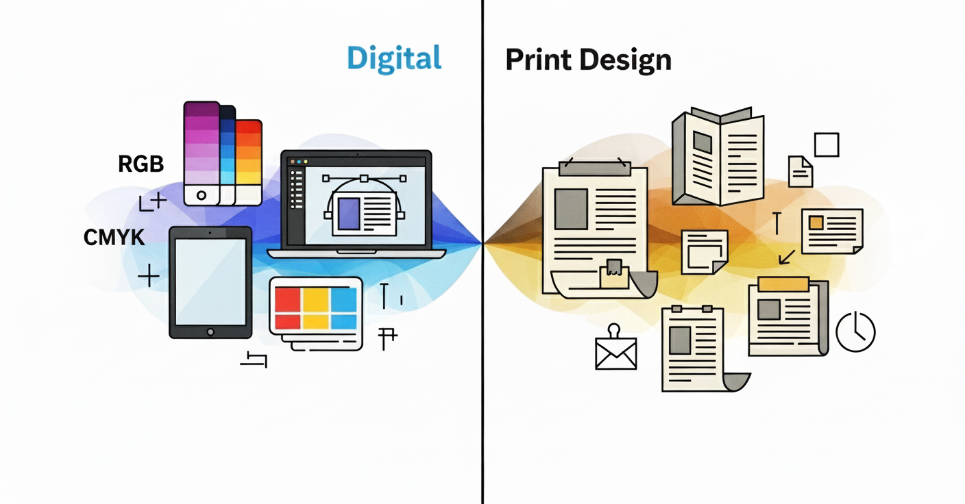
Print images should be high-resolution (300 DPI minimum) and in CMYK color mode for accurate reproduction. You can position them precisely, use bleeds that extend to page edges, and incorporate images of any size. The physical quality of paper and printing affects how colors appear, so working with your printer for color proofing is essential.
For ebooks, RGB color mode is standard since images appear on screens. Resolution can be lower (72-150 DPI saves file size without sacrificing screen quality). Keep images centered and sized appropriately. Large images may force awkward page breaks on some devices. Ensure each image has descriptive alt text for accessibility.
Consider whether images are essential or decorative. In print, decorative elements enhance the physical object’s appeal. In ebooks, they increase file size and may disrupt reading flow, so include them more judiciously.
Navigation and Structure
Print books rely on physical navigation, page numbers, a table of contents, and the ability to flip through pages. Headers and footers provide context about the location within the book. Chapters begin on right-hand pages, and blank pages may separate sections.
Ebooks need robust digital navigation. A functional table of contents with hyperlinks is crucial, allowing readers to jump directly to chapters. Forget about forcing page breaks or blank pages, they create awkward gaps on some devices. Instead, use chapter breaks and let the reading app handle pagination.
Include internal hyperlinks for cross-references, footnotes, and endnotes. These enhance the ebook experience significantly, though they’re obviously impossible in print. Conversely, page number references that work in print become meaningless in ebooks where pagination varies by device and settings.
Color and Visual Elements
Print design can leverage the full spectrum of color, with spot colors, gradients, and rich blacks creating visual depth. The paper quality affects color reproduction. Glossy paper enhances vibrancy while uncoated stock offers a softer, more natural appearance.
Most ebooks are read on devices that display color beautifully, but many dedicated e-readers use e-ink technology that only shows grayscale. Design with this in mind ensure sufficient contrast so that elements remain distinguishable even without color. Test how your decorative elements appear in both color and grayscale modes.
Special Features and Enhancements
Print books can include physical special features like embossing, foil stamping, textured covers, ribbon bookmarks, and French flaps. These tactile elements create a premium feel that ebooks cannot replicate.
Ebooks offer their own unique capabilities. Hyperlinks connect to external resources, embedded audio or video can enhance certain genres (particularly educational content), and searchable text helps readers find specific passages instantly. Interactive elements like quizzes or clickable diagrams work well in enhanced ebooks, though they require more complex coding.
File Formats and Technical Requirements
Print files typically go to press as high-resolution PDFs with specific settings for bleeds, trim marks, and color profiles. Your designer or printer will have exact specifications for file preparation.
Ebooks primarily use EPUB format (the industry standard) or MOBI/AZW for Amazon Kindle. These formats use HTML and CSS under the hood, so clean, semantic code ensures better rendering across devices. Simpler designs convert more reliably, which is why ebook design emphasizes structure over decoration.
Making Design Decisions for Both Formats
Choosing between ebook vs print design isn’t about deciding which format is better. If you’re publishing in both formats simultaneously, design for print first if your book contains complex layouts, extensive images, or design-heavy elements like poetry or cookbooks. Then create a simplified ebook version that maintains the essential structure while adapting to digital constraints.
For text-heavy books like novels or business books, design can be relatively consistent between formats. Focus on clean typography, clear chapter breaks, and logical structure that translates well to both mediums.
Consider your audience’s preferences. Literary fiction readers may prefer print’s tactile experience, while business book readers often choose ebooks for searchability and portability. Technical books might warrant enhanced ebooks with video demonstrations, while photography books demand print’s superior image quality.
Final Thoughts
Both print and ebook formats have distinct advantages and limitations. Print offers artistic control and physical presence; ebooks provide accessibility, searchability, and convenience. Rather than viewing one format as superior, recognize that excellent design means making appropriate choices for each medium. A book designed thoughtfully for its intended format provides readers with the best possible experience, whether they’re holding pages in their hands or reading on a glowing screen.
Understanding these best practices ensures your content shines in whatever format your readers choose, creating professional, enjoyable reading experiences that honor both the tradition of print and the innovation of digital publishing.
Need professional book design for print or ebook formats? Design Shifu offers unlimited graphic design support to help authors create polished, publication-ready books without agency pricing.
FAQs
What is the main difference between ebook and print book design?
The main difference is flexibility. Print books have fixed layouts with precise control over typography and spacing, while ebooks use reflowable content that adapts to different screen sizes and reader preferences.
Should ebooks and print books use the same fonts?
What file format is best for ebook design?
Why do complex layouts work better in print than ebooks?
Can images be used the same way in ebooks and print books?