As long as there are buildings and houses, people will want roofs on them. The roofing business is excellent, but competition is fierce, so you must stand out from the crowd. A smart yet contemporary business card can help you make an impactful first impression. Stay with us through this blog if you want to set yourself apart from the card.
Roofing Business Cards Examples 2022
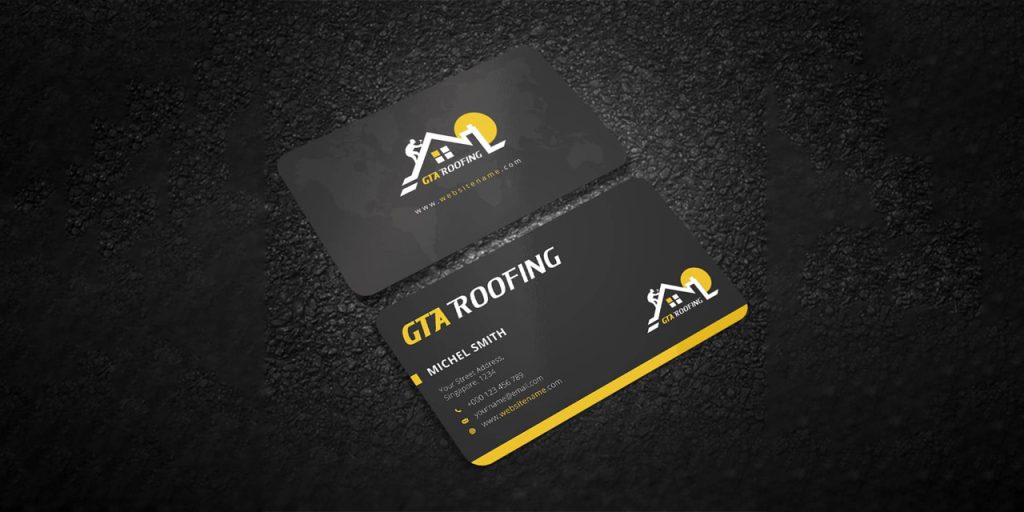
Minimal Roofing Business Cards
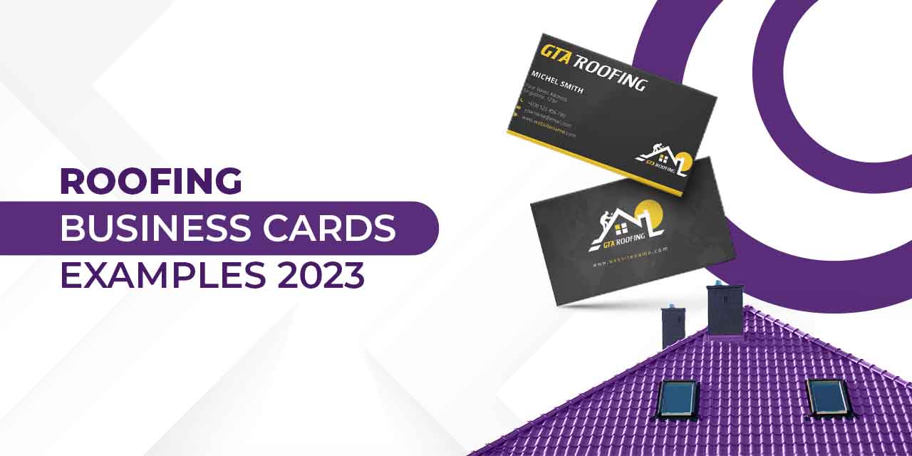
You can opt for a business card that appears clean and contemporary despite its simplicity. When it comes to business cards, in particular, branding is everything. This type of business card speaks professionalism.
Put the Concept to Use
Give the card a brand-friendly hue. Place your logo in white on top of a dark, “brand-friendly” colour. The colour scheme should be reversed on the card’s opposite side, and the brand typeface should be used with centered text. Make the company’s name more prominent, implement the brand’s tagline in a secondary font, and use a straightforward sans-serif font for other information. You can use simple house illustrations to add to your card design.
Vertical Layout Roofing Business Cards
‘Think Out of The Box’; we often hear this phrase. Well, it’s time to put that to use. Usually, business cards are made in a horizontal format.
Companies sometimes use a vertical layout to get people’s attention in their business card design.
Put the Concept to Use
Change the layout from vertical to horizontal. Try to incorporate artistic designs and geometric lines for a contemporary look. Stick to minimal illustrations and crisp fonts. Opt for only two colors in the card design.

Metal Roofing Business Cards
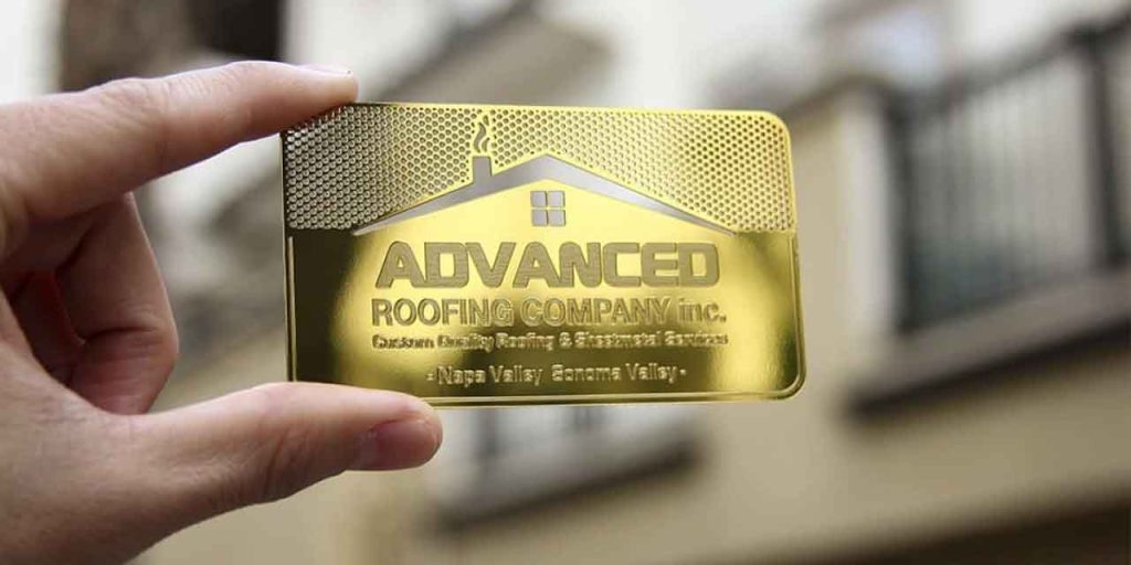
Metal Business cards have a unique design that you can choose from. This business card will make you stand out among your competitors.
Metal business cards should be your first preference if you want to impress people.
Put the Concept to Use
These cards cost at least $3 to $4 each, so your customer lifetime value (CLV) should be high if you spend that much per card. However, if you believe in having an impact and are prepared to go to extreme lengths, this may be the perfect opportunity for you. This business card seems like polished brass, but it’s not.
Folding Shingle Business Cards
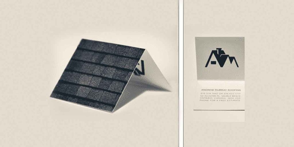
One of the more creative business card designs you can try is a Folding Shingle Business Card. Basically, a business card folded into the shape of a house and had shingles printed on it.
Put the Concept to Use
Consider how your business card can be more than just a printed piece of paper. How can you encourage recipients of your business card to actually notice its layout? You’ve enhanced the association with your firm above the ordinary if you can get them to play with it or talk about it for longer than 15 seconds. Never undervalue the impact of “REMARKable.”
Sustainable Business Card
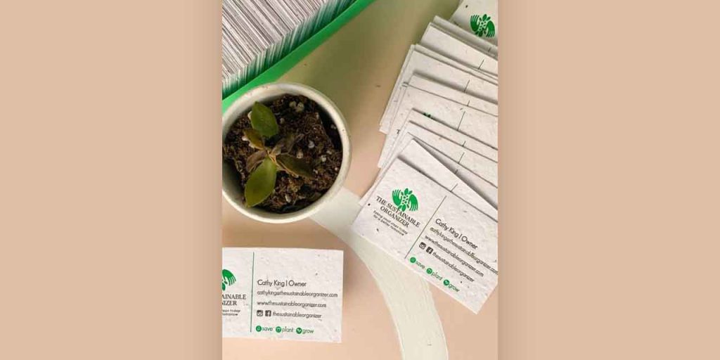
In 2022, businesses are getting more environmentally friendly everywhere. Why not print business cards using ecologically friendly materials like recycled paper because most of them are thrown away? Or, if it works for your company, choose cork or recycled cardboard. You’ll still be able to design whichever you want, but with the benefit of sustainability.
Any business that values sustainability and incorporates it into every aspect of how they conduct business should consider adopting this business card trend.
Put the Concept to Use
The roofing business can customize the card design. To make sustainable cards, newspapers, paper cups, paper shopping bags, etc., can be recycled. Business cards are available in the market that can be planted in the soil also called plantable business cards. Such measures by the business can build customers’ confidence to opt for your services.
Do’s & Don’ts of Designing Roofing Business Cards
DO’s
Highlight Important Information
When designing your business card, highlighting the right information is essential. Always remember that the customer will focus on the information you showcase on the business card. Therefore, Company’s Name and Phone Number should be the primary focus and be mentioned on the card’s front side. Adding the company’s website, OR code, and social media handles to the roofing business card is also vital. Add this information to the back side of the business card.
Use Clean, Modern Fonts
Fonts play an essential role in any design. Always use the appropriate font style in the business card. Choosing a font depends on several factors, such as the type of business, the message’s nature, and design types like logos, brochures, and many more. Arial, Times New Roman, Helvetica, etc., have become outdated font styles. For the Roofing business card design, use stylish and modern font styles which define the business and convey the correct message to the audience. Fonts such as Impact, Raleway, Lato, etc., can be chosen for the card design.
Use Periods and Bullets
A clean, minimal design looks more attractive than a sloppy, cluttered card design. Listing information in points helps the reader decode the message quicker and more efficiently. Use bullet points to record information on the card to make the format appear smart and classy.
A good tip is to exclude words such as web, fax, and email and remember that you don’t need to put the old “www.” or ‘https’ before your website address anymore. This will help you decrease the information on the card too.
Keep the Color Scheme Legible
One of the most crucial factors to keep in mind while designing a business card is the number of colours used in the card design. Always use a maximum of three colours in the business card design. The design colours also depend on many factors, such as the brand’s core values, the nature of the business, design type, and many more. Using colours based on these factors will add a more meaningful story to your design.
DON’Ts
Overcrowding Information
When you add too much information to the card, it looks unprofessional. Avoid adding unnecessary information to your business card. Use a tent card(double-sided card) to make more space for your text.
No White Space
Less is always more. White space is your best friend when it comes to chic and classic designs. You can make your card look clean by adding less content and designs to your business card. Try to decrease the font size to 8-9 points rather than 12. The business card is too small for a big font. Give the smaller font enough white space so your information can still stand out.
Skimp on Quality
Your target niche has fading eyesight customarily. A small font size creates a negative Moment of Truth if THEY CAN’T READ THE INFORMATION! Therefore, it is vital to imprint high quality business cards. Use at least 12 pt. card stock, also referred to as 100 lb. card stock. Customers will use the quality of your card as a defining factor to judge the quality of your service.
Scattered Text & Typing Errors
A strong right or flush left is much more potent than a centred alignment. On the other hand, a typo in your card can create a poor image in the customer’s mind. It is advised to set proper alignment to the text and check for any typing errors before printing the business card.
What to include in Your Roofing Company’s Business Cards?
Contact Information
The business card’s basic function is to provide important information about the company. A simple logo and the company’s name on the card will not do the job. Make sure to add the following information so that your potential customers can reach you easily:
- Phone number (direct and business, if separate)
- Email address
- Physical address (if any)
Website
In the digital era, every business has its website to make the user shopping experience convenient, but not all are vigorously updated. Therefore, you can take advantage by adding a URL and a QR code of your company website to your business card, instantly differentiating you from your competition.
Social Media Handles
Almost everyone nowadays has access to social media such as Facebook and Instagram nearly every day. To verify credibility, customers, most of the time, check the social media of any company. Indeed, you don’t want to miss the opportunity to connect with your potential customers on social media platforms if you aren’t connected already. Here are a few ways to display the social media channels of your new business cards:
- Complete URLs featuring your usernames or social media page titles (e.g., www.facebook.com/designdshifu)
- Usernames for profiles (e.g., Instagram: @designshifu)
- Add social media platforms icons where you have profiles
Takeaway
We hope that this read was worthwhile! Want to create such trendy roofing business card designs for your roofing business? Why not consider Design Shifu? You get a dedicated designer to take care of all your design needs on a monthly subscription. Additionally, your subscription also comes with a 100%, 14-day money-back guarantee.

