
You’ve just finished what you’re sure is a flawless design. Colors? Spot on. Typography? Perfect. Layout? Impeccable.
Then the client drops the bomb: “Oh, we also need this in print. Can you just use the same file?”
And suddenly… panic. The RGB colors won’t match. The 72 DPI image looks pixelated. Fonts refuse to embed. That fancy drop shadow? Forget it. Your gorgeous digital masterpiece is about to turn into a printing nightmare.
Sound familiar? You’re not alone. Let’s break down why print vs digital design isn’t just a technicality, it’s a whole different ballgame, and knowing how to tackle each can save your designs and your sanity
TL;DR
- Print = permanent, tactile, premium impact, limited edits.
- Digital = flexible, interactive, fast, measurable.
- Hybrid = combine both for maximum impact.
- Avoid RGB in print, low DPI, and ignoring client context.
- Start with the restrictive medium (usually print) and expand to digital.
Why This Even Matters Anymore
It’s 2025. Everything’s digital, right? We’re all glued to our screens. Print is dead. But, it’s not.
Walk into any upscale restaurant. They’ve got printed menus – the nice kind, with thick paper stock that feels expensive. Go to a trade show. Everyone’s handing out brochures and business cards, not just QR codes (okay, some QR codes, but you get my point). Check your mailbox. There’s probably some beautifully designed direct mail piece from a brand that knows print still converts.
Print isn’t dead. It’s just selective now.
And that’s actually harder for us as designers. When everything was printed, you learned to print. When digital exploded, you learned digital. Now? You need to know both, know when to use each, and know how to switch between them without losing your mind or your client’s budget.
I learned this the expensive way. Second year freelancing, landed a sweet gig with a boutique hotel. They wanted a brand refresh – website, social media templates, and a printed welcome booklet for guests. “No problem,” I said, full of confidence and naivety.
I designed everything digitally first. Made it gorgeous on screen. Then tried to convert it to print.
The colors were completely wrong. The layout didn’t work on physical pages. The fonts looked weird. I basically had to redesign half of it from scratch, eating hours I couldn’t bill for.
That’s when I learned: these aren’t just different outputs. They’re different design languages.
The Fundamental Difference (That Nobody Explains Well)
Here’s what most articles won’t tell you straight.
Digital design is temporary. Print design is permanent.
Sounds obvious, but think about what that actually means for your work.
Digital gives you:
- The ability to fix mistakes after launch (thank god)
- Animation and interactivity
- Unlimited colors (literally millions)
- No physical constraints
- Easy A/B testing
- Analytics to see what works
Print gives you:
- One shot to get it right
- Tactile experience (texture, weight, finish)
- Forced simplicity (can’t rely on hover states or video)
- Physical permanence (it exists in space)
- No analytics (you can track response, but not behavior)
- That feeling when you hold something well-made
Neither is better. They’re just different tools for different jobs.
And the real skill? Knowing which tool to reach for when a project lands on your desk.
When Print Actually Wins
Let me tell you about a client I worked with last year. High-end financial advisor. Older clientele, mostly 50+. They wanted to rebrand and were convinced they needed to “go digital” – emails, social media, the works.
I designed everything. It looked great. Launch day came.
Engagement was… crickets.
Turns out, their clients weren’t really checking email newsletters. They weren’t on Instagram. But you know what they did respond to? A beautifully printed quarterly report we almost didn’t do because “everything should be digital.”
Response rate was 10x higher than the digital stuff.
Print works best when
You want to feel premium. There’s something about holding a thick business card or a well-designed brochure that screams quality. You can’t replicate that digitally. A luxury brand selling $10,000 watches? They need print. A SaaS startup? Probably not.
Your audience is older or less tech-savvy. Not always, but often. My mom still clips coupons from mailers. She ignores every email newsletter. Your audience dictates your medium, not trends.
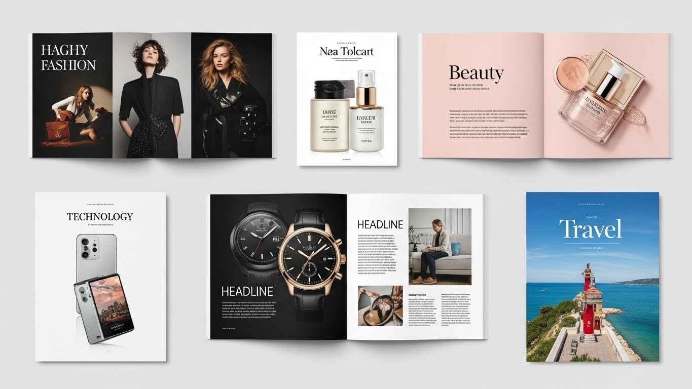
The message needs to stick around. Event invitations, annual reports, portfolio books – these are things people keep. They sit on desks. They get shared physically. Digital gets deleted or lost in the scroll.
Tactile experience matters. Restaurants use printed menus because touching nice paper while deciding what to eat is part of the experience. Wedding invitations are printed because the weight of the card stock communicates importance. The physical object carries meaning.
You’re going for impact over reach. Print costs more per impression, but each impression hits harder. Direct mail has a higher cost per person reached, but it also gets attention in a way that the 47th email of the day just doesn’t.
I designed a product launch campaign for a craft brewery once. We did both digital ads and printed coasters distributed to bars. Guess which one people actually remembered? The coasters. Because they held them. Used them. Saw them every time they set down their beer.
When Digital Is Your Only Logical Choice
Okay, but let’s be real. Most of the time these days? You’re designing for screens.
Digital is the move when:
- You need speed and flexibility. Launching a flash sale? Running time-sensitive ads? Need to update information constantly? Digital. You can’t recall a print run if something changes.
- The budget is tight. Printing costs money. Paper, ink, shipping, storage. Digital has costs too (hosting, ads, subscriptions), but the per-impression cost is usually way lower. Especially for reach.
- You want interaction. Buttons that click. Forms people fill out. Videos that play. Animations that guide attention. None of this exists in print. If your design needs interactivity to work, it’s digital by default.
- Testing and iteration matter. A/B testing, heat maps, scroll tracking, conversion funnels – you can measure everything digitally. Try a headline variation, see what performs better, adjust in real-time. Can’t do that with a printed brochure.
- Your audience lives online. If you’re targeting Gen Z for a new app? They’re not reading mailers. They’re on their phones. Meet your audience where they are, not where you wish they were.
- Reach matters more than impact. Want to get your message in front of 100,000 people? Digital is exponentially more cost-effective. Want to make a lasting impression on 100 carefully selected people? Maybe print.
I worked with a startup accelerator that was trying to recruit applicants. They were spending money on printed brochures to mail to universities. I asked them: “Are college students checking their physical mailboxes or their Instagram?”
We shifted the budget to digital, created scroll-stopping social content and targeted ads. Applications tripled.
Same budget. Different mediums. Better results.
The Technical Stuff That’ll Save Your Ass
Alright, let’s get into the nitty-gritty. The stuff that separates designers who “kind of know” from designers who actually know.
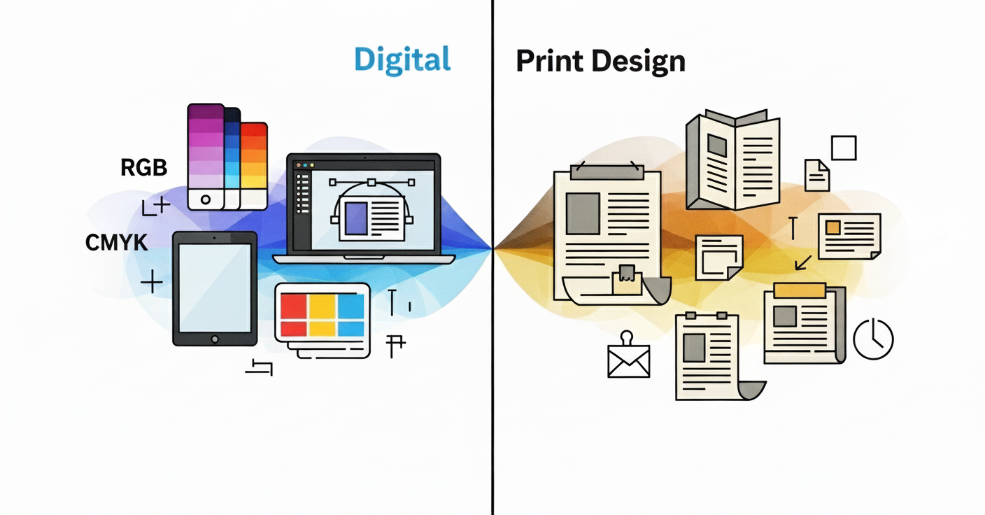
Color: RGB vs. CMYK (And Why It Matters More Than You Think)
- RGB (Red, Green, Blue) is for screens. It’s an additive color model where varying intensities of these colors are combined to create colors. Your monitor emits light. That’s why digital colors can be so vibrant and glowing.
- CMYK (Cyan, Magenta, Yellow, Key/Black) is for print. Unlike the RGB model which adds light to create colors, CMYK works by subtracting light absorbed by inks. Paper doesn’t emit light, it reflects it.
Here’s the painful truth: some RGB colors literally cannot be printed in CMYK.
That bright, electric blue that looks amazing on screen? It’ll look muddy and disappointing when printed. That neon green? Good luck. RGB provides a wider array of color possibilities, and when RGB is converted to CMYK, colors can look muted.
I’ve had so many conversations with clients where I have to explain: “Yes, I know it looks different. No, the printer didn’t mess up. This is just physics.”
What you actually do:
- If you’re deciding between CMYK and RGB for printing, CMYK is generally the better choice. Design in CMYK from the start if you know it’s going to print.
- If you’re doing both print and digital, design in CMYK first, then expand to RGB for digital (easier than the other way around)
- CMYK will look dimmer and muddier on your screen. It’s normal. Unless you work with a fully calibrated monitor, don’t try to adjust CMYK colors.
- Always do a test print before a big run – colors on screen will never perfectly match paper
Resolution: The DPI Reality Check
- Digital = 72-96 PPI (pixels per inch). A lower PPI (72) means smaller file sizes, which translates to faster loading times, and given that screen resolutions vary and people often view screens from further away, the loss in detail at 72 PPI isn’t typically noticeable.
- Print = 300 DPI minimum. Printing at 72 DPI will result in pixelated and blurry images. At 300 DPI, individual dots are too small for the human eye to distinguish at normal viewing distance.This is exactly why print requires high-resolution images – check out this guide for deep dive
The math is brutal. A 1920×1080 pixel image is perfect for a full HD screen. Try to print that at 300 DPI? You get a 6.4 x 3.6 inch image. Tiny.
For a standard letter-size print (8.5 x 11 inches) at 300 DPI, you need a 2550 x 3300 pixel image. That’s an 8.4 megapixel image versus 2 megapixels for digital.
- Translation: That stock photo that looks great on your website will look like trash if you try to print it large. Always source high-resolution images if there’s any chance of print use.
I once designed a conference poster using images pulled from a client’s website. It looked fine on my screen. Got to the print shop, and they called me: “These images are 72 DPI. This is going to look terrible at 24×36 inches.”
I had to scramble to find high-res versions. Delayed the project by two days. The client was not happy.
Typography: What Works Where
Digital typography:
- Sans-serif fonts usually read better on screens (though this is changing with high-res displays)
- You can use web-safe fonts or load custom fonts via services like Google Fonts
- Line length matters a lot – text that’s too wide is hard to read on screens
- Hierarchy needs to be super clear because people scan, not read, which ties directly into designing visuals that convert online. You can go smaller if needed because users can zoom.
Print typography:
- Serif fonts are traditionally better for long-form print reading (though again, this is debated)
- You need to embed fonts or outline them to avoid font substitution disasters
- Kerning and tracking are more noticeable in print – you need to be meticulous
- Body text is typically 9–12pt depending on the font
- What looks good on screen might be too small or too large in print
The biggest mistake? Using fonts that don’t have proper print licensing. Just because you can use a font on your website doesn’t mean you have the rights to use it in a printed brochure that’s being commercially distributed.
If you want a deeper dive into choosing the right fonts for print and digital, check out our guide on Typography in Book Layout: Fonts That Improve Readability.
Also comic sans. Just don’t. In any medium. Please.
Bleed, Trim, and Safety Margins (The Print-Specific Headaches)
If you’ve only done digital design, these concepts might be foreign.
Bleed: Extra design that extends past the trim edge. Usually 0.125 inches (3mm). Why? Because cutting isn’t perfect. If your design ends exactly at the edge and the cut is slightly off, you get an ugly white strip.
- Trim: Where the paper actually gets cut. Your finished size.
- Safety margin: The area inside the trim where you keep important stuff (text, logos). Usually 0.125-0.25 inches. Because if the cut is slightly off, you don’t want your text getting chopped.
Digital has none of this. Your design goes to the edge? It goes to the edge. Perfect. Every time.
Print? You need to think in layers: bleed extends out, design exists in the middle, safety keeps important stuff secure.
I’ve seen designers send files without bleeding. The print shop has to add white borders or reject the job. It’s embarrassing and it costs time and money.
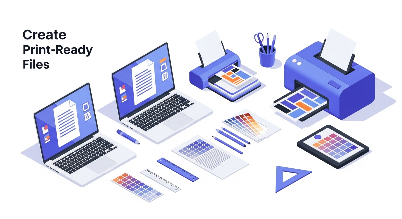
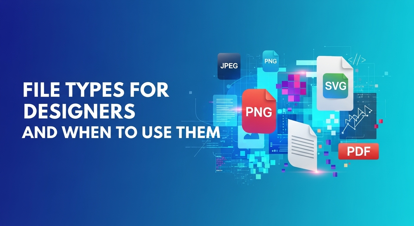
File Formats That Matter
Digital:
- JPEG for photos (lossy, compressed, small file size)
- PNG for graphics with transparency (lossless, larger files)
- SVG for logos and vectors (scalable, perfect for responsive design)
- GIF for simple animations (though video formats are better now)
- WebP for modern web (better compression than JPEG, but not universal support yet)
Print:
- PDF (usually PDF/X-1a or PDF/X-4) – industry standard
- TIFF for high-quality images
- AI (Adobe Illustrator’s native format) offers maximum editing flexibility and preserves all design elements, including layers and effects, making it the preferred choice for complex vector-based artwork.
- EPS for vectors (though these are being phased out)
- Never, ever send a Word doc to a print shop and expect good results
The biggest screwup I see? Designers sending a 72 DPI RGB PNG to print. It won’t work. It physically cannot produce good results. And then everyone’s frustrated and pointing fingers.
The Hybrid Approach (Because Life Is Complicated)
Real talk: most projects now need both.
A new restaurant needs a website AND printed menus. A product launch needs social media assets AND retail packaging. A corporate rebrand needs digital templates AND printed stationery.
Here’s how to handle it without doing everything twice:
- Start with a flexible design system. Create logos, color palettes, and typography that work in both mediums. Test your brand colors in CMYK early. Make sure your logo works in one color for certain print applications.
- Design the more restrictive medium first. Usually that’s print. The constraints of CMYK and physical production will force you to make smart choices. Then you can expand those designs for digital, where you have more freedom.
- Create master files in vector format. Use Illustrator or Figma for core brand elements. Vectors scale infinitely and can be output for both print and digital without quality loss.
- Version control is your friend. Name files clearly: “Logo_RGB.png” vs “Logo_CMYK.pdf” vs “Logo_Web.svg”. In the future you will thank the present you.
- Budget for both from the start. Don’t design everything in RGB and then tell the client print will cost extra to convert. Set expectations early about deliverables and formats.
I have a client – a mid-size B2B company, where we maintain a full design system with versions for everything. Print templates, digital templates, social media specs, email headers, PowerPoint themes, the works. Initial setup took time, but now anyone in their organization can create on-brand materials for any medium.
That’s the goal. A system, not just individual designs.
The Questions You Should Ask Before Starting
Every project should begin with these questions. Not just “what do you want designed?” but:
Where will this be seen?
- Online only? Print only? Both?
- What specific formats? (Website, social media, brochure, billboard, etc.)
- What devices? (Desktop, mobile, tablet for digital)
- What sizes? (For print, exact dimensions matter)
Who’s the audience?
- Age range (affects medium choice)
- Tech comfort level
- Where they spend time (digital spaces vs. physical locations)
- What they respond to
What’s the goal?
- Awareness? (Maybe print for impact)
- Immediate action? (Probably digital for tracking and speed)
- Long-term relationship building? (Could be either)
The timeline?
- Rush job? Digital is faster
- Need to coordinate with physical events? Print requires lead time
What’s the budget?
- Print costs more per unit but less to produce initially
- Digital can be cheaper per impression but requires ongoing investment
A client once came to me wanting printed postcards for a new app launch. I asked: “Who’s the audience?”
Tech-savvy millennials.
“Where will you distribute these?”
Coffee shops and co-working spaces.
“What’s the goal?”
App downloads.
I suggested: skip the postcards, invest that money in Instagram ads with a QR code that goes straight to the app store. Better targeting, direct tracking, no printing costs, faster deployment.
They went with it. Saved money, got better results.
The right medium is determined by strategy, not preference.
Common Mistakes (And How To Avoid Them)
Let me just run through the greatest hits of design disasters I’ve witnessed:
- Mistake #1: Designing digital-first and trying to force it to print. Those thin lines that look elegant on screen? They’ll disappear in print or look broken. That white text on a light background that works okay on a glowing screen? Impossible to read on paper.
- Fix: If you need both, start with print constraints.
- Mistake #2: Not considering the physical context. I designed a beautiful business card once with a dark background and light text. It looked amazing on screen. In person? Fingerprints everywhere. The matte finish showed every touch.
- Fix: Think about how print pieces will actually be handled and used.
- Mistake #3: Ignoring platform-specific specs. Instagram posts, Facebook ads, Google display ads, LinkedIn banners – they all have different size requirements and safe zones. One size doesn’t fit all.
- Fix: Create a specs sheet for every platform you use regularly.
- Mistake #4: Using effects that don’t translate. Drop shadows, glows, certain gradients – these can look weird in print. RGB transparency effects? Forget it.
- Fix: Keep effects simple and testable if you’re going cross-platform.
- Mistake #5: Not getting proof. Never, ever approve a print job without seeing a proof first. Colors will surprise you. Finishes will look different than you imagined. Paper stock affects everything.
- Fix: Budget time and money for proofs, especially on important projects.
When The Client Asks For Both (And The Budget Says No)
This happens constantly.
Client wants the full package: website, social media, email templates, printed brochures, business cards, signage, promotional materials. The budget is not enough for all that.
How I handle it:
Phase it. “Here’s what we can do now, and here’s the roadmap for the next six months as the budget allows.”
Prioritize ruthlessly. Ask: what gets you to your goal fastest? If it’s a new business, maybe they need digital presence first and can hand-write business cards for a month.
Create smart templates. Design a system where they can create some materials themselves using your templates. Canva templates for social media, for example, while you handle the complex print work.
Show them the math. “A print brochure costs $X per unit and reaches Y people. Digital ads cost $X and reach Y people. Here’s the ROI calculation for your industry.”
Suggest alternatives. Instead of a full printed catalog, maybe a simplified one-pager and a robust digital version. Instead of printed business cards for everyone, perhaps digital business card apps for most staff and printed cards just for leadership.
Sometimes you have to be a consultant, not just a designer. Help them make smart choices with limited resources.
The Future (Because Everything’s Changing)
Here’s what I’m seeing and where I think this is headed:
Print is becoming more specialized and premium. It’s not going away, but it’s becoming a choice, not a default. The stuff that gets printed now is being designed to wow, not just to communicate.
Augmented reality is blurring the lines. Print pieces with QR codes that unlock digital experiences. Packaging that comes alive when you point your phone at it. We’re seeing hybrid experiences that use both mediums.
Sustainability is forcing changes. Clients are thinking harder about whether they actually need that printed piece. Digital is often seen as more eco-friendly (though data centers have environmental impact too). Expect more pressure to justify print.
Design tools are getting better at cross-platform. Figma, Adobe XD, and other tools are making it easier to design for multiple outputs from one file. Not perfect yet, but improving.
The skill of knowing when to use what becomes more valuable. As tools make execution easier, strategic thinking becomes the differentiator. Any designer can make something look good. Great designers know which medium will make it work.
Real Talk: What Actually Matters
After designing for both print and digital for years, here’s what I’ve learned:
The medium isn’t the message, but it shapes it. McLuhan was right. How you say something affects what you’re saying. A printed invitation feels different than a Facebook event, even if the words are identical.
Most clients don’t understand the differences. They just want good design. It’s your job to guide them, educate them, and make smart recommendations.
You can’t be precious about your designs. That color will change for print. That layout won’t work on mobile. Learn to adapt without getting emotionally attached to every pixel.
Testing saves relationships. Print proofs for print. Device testing for digital. Never skip this step.
The best designers are bilingual. Great designers are fluent in both print and digital. They don’t favor one over the other, they simply use the right tool for the job.
Your Action Plan (Because Theory Doesn’t Pay Bills)
If you’re reading this and realizing you’re stronger in one medium than the other, here’s what to do:
For digital designers who need to learn print:
- Take a project to a print shop and watch it happen. See the actual printing process.
- Order business cards or postcards of your own design. Feel what works and what doesn’t.
- Study print design portfolios. Notice how they handle color, typography, and space differently.
- Get comfortable with CMYK, bleed, and print specifications. Make them second nature.
Print designers who need to level up digitally:
- Learn responsive design principles. Things need to work at multiple sizes.
- Study web design systems and component thinking.
- Understand web performance – file size matters differently than in print.
- Learn basic HTML/CSS even if you don’t code. Understanding how designs become websites makes you better.
For everyone:
- Build a swipe file of great print and digital work. Study what works in each.
- Start thinking in systems, not individual pieces.
- Practice explaining the differences to non-designers. Client education is part of the job.
- Stay curious about new formats and platforms. AR, VR, voice interfaces – the medium landscape keeps expanding.
Key Takeaways
- Print and digital are different languages.
Each medium has its own constraints, strengths, and audience expectations, what works on screen may fail in print, and vice versa. - Start with the restrictive medium.
If a project requires both, design for print first (CMYK, high resolution, bleed) and then expand to digital. - Resolution matters.
Digital images can be low DPI (72–96 PPI), but print requires at least 300 DPI to avoid pixelation and poor-quality results. - Typography choices differ.
Sans-serif fonts often read better on screens, while serif fonts are preferred for long-form print. Always check licensing for print use. - Color modes aren’t interchangeable.
RGB is for digital screens, CMYK is for print. Some colors simply cannot be replicated across both. - Bleed, trim, and safety margins are critical in print.
Neglecting these can lead to chopped-off text, unwanted white borders, or rejected print jobs. - File formats matter.
Use PNG, JPEG, SVG for digital. Use PDF/X, TIFF, AI for print. Never send low-res web images to print. - Audience and goal dictate the medium.
Premium tactile experience, older audience, or long-lasting impact? Go print. Speed, interactivity, and broad reach? Go digital. - Hybrid is the future.
Many projects need both print and digital. Build flexible design systems, use vector formats, and set clear version control. - Educate clients and manage expectations.
Always explain why “same file for print” rarely works. Show proofs, outline costs, and suggest phased approaches when budgets are tight.
The Bottom Line
Print vs. digital isn’t actually a versus situation.
It’s not a matter of either/or knowing when, why, and how to use each medium is key. Recognizing that print and digital have different strengths lets you leverage both strategically for the best results.
A poster on a wall creates a moment in physical space. A banner ad targets specific people at specific times. A printed invitation feels important and personal. An email reaches more people faster and cheaper. None of these are better or worse – they’re just different.
Your job as a designer isn’t to have a preference. It’s to know which tool solves the problem best.
So next time a project lands on your desk, don’t default to digital because that’s what you’re comfortable with. Don’t insist on print because you love the tactile experience. Ask the questions. Understand the goals. Choose the medium strategically.
And when the client inevitably asks if you can “just use the same file” for both?
You’ll know exactly why the answer is “not quite, but here’s what we’ll do instead.”
Now go design something great. In whatever medium actually makes sense.
(And seriously, always get a print proof. I cannot stress this enough.)
Frequently Asked Questions
Can I use the same design file for both print and digital?
Not usually. Print and digital have different color modes (CMYK vs. RGB), resolutions (300 DPI vs. 72 DPI), and file format requirements. A file optimized for screen often fails in print.
Why does my vibrant digital color look dull in print?
Digital screens use RGB, which can display a wider range of bright colors. Print uses CMYK, which subtracts light. Some colors simply cannot be replicated on paper.
What resolution should I use for print vs digital?
Digital images typically use 72–96 PPI, which is enough for screens. Print requires a minimum of 300 DPI to ensure sharpness and clarity.
Which fonts are best for print and digital?
- Digital: Sans-serif fonts like Helvetica or Open Sans for readability on screens.
- Print: Serif fonts like Times New Roman or Garamond for long-form reading. Always check font licensing for print use.
What is bleed, trim, and safety margin?
- Bleed: Extra design that extends beyond the cut edge to avoid white borders.
- Trim: The final size after cutting.
- Safety margin: Keep critical text and elements inside this zone to avoid accidental cuts.
Can I add effects like shadows or glows in print designs?
Some effects don’t translate well to print. Subtle gradients and drop shadows may look off, so simplify or test before printing.
Which medium should I prioritize if I have a limited budget?
It depends on your goal and audience. For broad reach and interactivity, digital is usually more cost-effective. For premium tactile experience or older audiences, print may deliver higher impact per impression.
How can I manage projects that need both print and digital?
- Start with the restrictive medium (usually print).
- Build flexible design systems using vectors.
- Maintain clear version control and file naming.
- Budget and phase work strategically.